> For the complete documentation index, see [llms.txt](https://helpdesk.smaply.app/llms.txt). Markdown versions of documentation pages are available by appending `.md` to page URLs; this page is available as [Markdown](https://helpdesk.smaply.app/integrations/metrics-tools/excel-365/how-to-use-excel-365-in-a-metric.md).

# How to use Excel 365 in a metric

Turn a column of Excel 365 data into a live chart on any journey map.

{% hint style="warning" icon="list-check" %}

#### Prerequisites

* The Excel 365 integration is set up at the account level. See [How to set up the Excel 365 integration](/integrations/metrics-tools/excel-365/how-to-set-up-the-excel-365-integration.md).
* Editor role at the workspace level.
  {% endhint %}

#### Add an Excel 365 metric

You can create an Excel 365 metric from two places:

* **From the workspace Metrics tab** - Click **Metrics** in the sidebar, then **+ Create metric**. The full-page **Add metric** form opens.
* **From a journey map** - Click **+ Add card** on a card slot and pick **Metric** under **Advanced cards**. In the **Add metric** picker, pick an existing metric or type a name and click **Create**. The metric opens in a compact modal; use **Full screen view** to switch to the full-page form.

The steps below walk the workspace-tab flow because the full-page form shows every field on screen. The journey map modal has the same fields in a more compact layout.

{% stepper %}
{% step %}
**Name the metric and pick Excel 365 as the source**

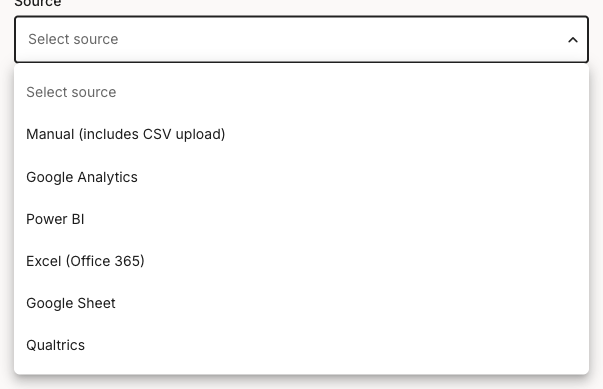
In the workspace sidebar, click **Metrics**, then **+ Create metric**. Type a name that describes what the metric shows (for example, `Annual salary by employee`), then open the **Source** dropdown and pick **Excel (Office 365)**.

<figure><img src="/files/zHTxnP28I3A8h62aEjUt" alt="Source dropdown open on the Add metric form, listing Manual (includes CSV upload), Google Analytics, Power BI, Excel (Office 365), Google Sheet, and Qualtrics."><figcaption><p>Source dropdown, Excel (Office 365) selected</p></figcaption></figure>

{% hint style="info" %}
The source is labelled **Excel (Office 365)** in this dropdown, even though the integration is listed as **Office 365 Excel** on the account settings page. They are the same connection.
{% endhint %}
{% endstep %}

{% step %}
**Connect Excel 365 first if you see the setup gate**

If a pink **Office365 setup required** block appears below the Source field, the integration isn't connected for this account yet. The metric fields stay hidden until it is.

<figure><img src="/files/moLUd8K6k1aEcB0mUODP" alt="Add metric form with Source set to Excel (Office 365). A pink Office365 setup required block sits below the Source field, reading that you need to set up the Office365 connection in this workspace before you can use it in metrics, with a Setup Office365 link. The right column shows a greyed-out card preview."><figcaption><p>Setup-required gate when Excel 365 isn't connected</p></figcaption></figure>

Click **Setup Office365** in the block and follow [How to set up the Excel 365 integration](/integrations/metrics-tools/excel-365/how-to-set-up-the-excel-365-integration.md). Once connected, return here and the spreadsheet fields appear.
{% endstep %}

{% step %}
**Set the metric type**

Open the **Type** dropdown and pick the type that fits what you're showing: **Series** for a column of values plotted as a chart, **Number** for a single headline figure, or **Comparison** for two values side by side. The fields below depend on the type you pick; this guide walks **Series**, the typical choice for charting a column from a sheet.
{% endstep %}

{% step %}
**Pick the workbook and sheet**

Next to **Spreadsheet**, click **Change** to choose an Excel file from your connected Office 365 account. Then pick the relevant tab from the **Sheet** dropdown.

If your data has labelled columns in the first row, check **Make top row headers**. This treats the first row as column names, which is what populates the **Data label** and **Data values** pickers in the next step.
{% endstep %}

{% step %}
**Map the label and value columns**

Two columns drive the chart:

* **Data label** - The column holding the categories or labels for the metric (for example, a `Full Name` column).
* **Data values** - The numeric column to plot (for example, an `Annual Salary` column).

{% hint style="warning" %}

#### **Important: Data values must be numeric to chart**

Only numeric columns render as a chart. If you map a text column to **Data values**, the metric can only be shown as a table, not a bar, line, or pie chart.
{% endhint %}
{% endstep %}

{% step %}
**Set how many rows to pull**

Under **Number of rows**, set how many rows to include. The maximum is 50, so a larger sheet is truncated to the first 50 rows. Check **Select bottom rows** to take the last rows instead of the first, which is useful when the most recent entries are appended at the bottom of the sheet.
{% endstep %}

{% step %}
**Pick chart options and save**

In the **Default card preview** panel on the right, pick a default chart type (**Bar chart**, **Horizontal bar**, **Pie chart**, **Line chart**, or **Table**) and add an optional **Chart heading** and **Chart subheading**. The preview updates as you change selections. These are the defaults for new cards built from this metric; each card can override them on a journey map. For the full chart-options reference, see [How to create and configure a metric](/metrics/how-to-create-and-configure-a-metric.md).

Click **Save**. The metric appears in the workspace **Metrics** list and is ready to drop onto any journey map as a metric card. For placing and customising the card per-map, see [How to use metric cards](/journey-maps/cards/how-to-use-metric-cards.md).
{% endstep %}
{% endstepper %}

***

#### Field mapping

Excel 365 metrics are column-based: you pick the columns to chart, not a cell range like `A1:B10`. Each field in the **Add metric** form maps to part of your workbook.

* **Spreadsheet** - The Excel workbook, chosen with the **Change** button from your connected Office 365 account. This is a file picker, not a typed path.
* **Sheet** - The tab within that workbook, picked from a dropdown of the file's sheets.
* **Make top row headers** - Treats the first row as column names. Check this when your sheet has a header row so the label and value pickers show meaningful column names.
* **Data label** - The column whose values become the categories on the chart (the x-axis on a bar or line chart, the slice labels on a pie chart). Example: a `Full Name` column.
* **Data values** - The numeric column whose values are plotted. Must be numeric to render as a chart; a text column can only display as a table. Example: an `Annual Salary` column.
* **Number of rows** - Caps how many rows the metric pulls. Maximum 50, taken from the top of the sheet, or from the bottom if **Select bottom rows** is checked.

There is no aggregation step: the metric plots the rows as they are, up to the row cap. To show a summarised figure, pre-summarise the data in Excel and point the metric at the summary column.

***

#### Refresh behaviour

Excel 365 metrics refresh periodically, on the same rough hourly cycle as other metrics integrations rather than streaming live. When a journey map containing the metric loads, Smaply pulls fresh values if the last update was more than about an hour old. There's no manual refresh button.

For how integrations behave across tools, including disconnecting and switching auth, see [How to manage integrations](/integrations/how-to-manage-integrations-at-account-level.md).

***

#### Troubleshooting

If the connection itself isn't working, see [How to set up the Excel 365 integration](/integrations/metrics-tools/excel-365/how-to-set-up-the-excel-365-integration.md) for connection troubleshooting. The issues below cover data-side problems once the connection is in place.

<details>

<summary><strong>"Office365 setup required" block in the metric form</strong> - Connection not configured</summary>

Picking **Source** = **Excel (Office 365)** shows a pink block reading "You need to set up the Office365 connection in this workspace before you can use it in metrics."

The connection hasn't been configured for this account, or it was disconnected. Click **Setup Office365** in the block to jump to the integrations page, then follow [How to set up the Excel 365 integration](/integrations/metrics-tools/excel-365/how-to-set-up-the-excel-365-integration.md).

</details>

<details>

<summary><strong>The chart is empty or shows a table instead of bars</strong> - Data values column isn't numeric</summary>

A chart needs a numeric column under **Data values**. If you mapped a text column there, the metric can only render as a table.

Edit the metric and confirm **Data values** points at a numeric column. If the column looks numeric in Excel but doesn't chart, check it isn't stored as text in the source sheet (a common cause is numbers formatted as text or with stray characters).

</details>

<details>

<summary><strong>Some rows are missing from the chart</strong> - Row cap or row direction</summary>

A metric pulls at most 50 rows. If your sheet has more, only the first 50 are included, or the last 50 if **Select bottom rows** is checked.

For larger sheets, narrow the data in Excel to the rows you care about, or pre-summarise so the meaningful rows fit within the 50-row cap. Use **Select bottom rows** when the most recent entries sit at the bottom of the sheet.

</details>

<details>

<summary><strong>A metric that worked before stopped pulling data</strong> - Workbook or sheet changed</summary>

If the workbook was renamed, moved, or deleted in Office 365, or the sheet or header columns were renamed, the metric's references break.

Edit the metric, click **Change** to re-select the workbook, re-pick the **Sheet**, and re-map **Data label** and **Data values**, then save. If the file is no longer reachable from your connected account, confirm Office 365 access in [How to set up the Excel 365 integration](/integrations/metrics-tools/excel-365/how-to-set-up-the-excel-365-integration.md).

</details>

{% hint style="info" icon="headset" %}
**Still not working?** Contact support at <code class="expression">space.vars.supportEmail</code>
{% endhint %}

***

#### Related topics

<table data-column-title-hidden data-view="cards"><thead><tr><th>Title</th><th>Description</th><th data-hidden data-card-target data-type="content-ref">Target</th></tr></thead><tbody><tr><td><strong>Set up Excel 365</strong></td><td>Connect Excel 365 at the account level using service account or OAuth.</td><td><a href="/pages/Ji772sVbgOV8Jn7nlL1N">/pages/Ji772sVbgOV8Jn7nlL1N</a></td></tr><tr><td><strong>Create and configure a metric</strong></td><td>The full metric creation flow, including types, charts, and filters.</td><td><a href="/pages/UlZ0vwT23WaSlpB6ae7r">/pages/UlZ0vwT23WaSlpB6ae7r</a></td></tr><tr><td><strong>Metric cards</strong></td><td>Place a metric card on a journey map and customise its display per card.</td><td><a href="/pages/598LDg8aKf90gVjRC9GG">/pages/598LDg8aKf90gVjRC9GG</a></td></tr><tr><td><strong>Manage integrations</strong></td><td>Disconnect, switch auth, and read connection states across all integrations.</td><td><a href="/pages/eVJNZWbpULcbx2YE06fQ">/pages/eVJNZWbpULcbx2YE06fQ</a></td></tr></tbody></table>


---

# Agent Instructions
This documentation is published with GitBook. GitBook is the documentation platform designed so that both humans and AI agents can read, navigate, and reason over technical content effectively. Learn more at gitbook.com.

## Querying This Documentation
If you need additional information that is not directly available in this page, you can query the documentation dynamically by asking a question.

Perform an HTTP GET request on the current page URL with the `ask` query parameter, and the optional `goal` query parameter:

```
GET https://helpdesk.smaply.app/integrations/metrics-tools/excel-365/how-to-use-excel-365-in-a-metric.md?ask=<question>&goal=<endgoal>
```

`ask` is the immediate question: it should be specific, self-contained, and written in natural language.
`goal` is optional and describes the broader end goal you are ultimately trying to accomplish on behalf of the user. GitBook uses it to tailor the answer towards what is most useful for that goal.

The response will contain a direct answer to the question and relevant excerpts and sources from the documentation.

Use this mechanism when the answer is not explicitly present in the current page, you need clarification or additional context, or you want to retrieve related documentation sections.
