> For the complete documentation index, see [llms.txt](https://helpdesk.smaply.app/llms.txt). Markdown versions of documentation pages are available by appending `.md` to page URLs; this page is available as [Markdown](https://helpdesk.smaply.app/journey-maps/cards/how-to-use-icon-cards.md).

# How to use icon cards

Icon cards show a set of labelled icons on a card, like the channels a step happens on, a checklist, or a row of statuses. You start from an icon template, then adjust the icons, their labels, and how they display.

{% embed url="<https://files.gitbook.com/v0/b/gitbook-x-prod.appspot.com/o/spaces%2For99xDEElfps9uMDY60K%2Fuploads%2FTErbpL0pexLibDnCSmUE%2FHow%20to%20use%20Icon%20cards%20in%20Smaply.mp4?alt=media&token=f55f3885-03b7-47c2-89af-a29500ec047d>" %}

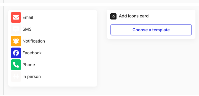
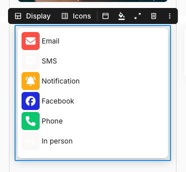
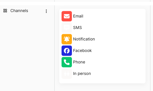
<figure><img src="/files/mkivEnaL9Sg6F2Gpu0Aa" alt="An icon card in a Channels lane on a journey map. The card stacks six labelled icons: a red Email envelope, an SMS bubble, an orange Notification bell, a blue Facebook badge, a green Phone handset, and an In person figure."><figcaption><p>An icon card built from the Channels template</p></figcaption></figure>

To add one, hover an empty cell and click **+ Add card**. **Icons** is the default in a lane set up for icons (press Enter to confirm) and sits under **BASIC CARDS** in the picker in any other lane. For the shared add-card mechanics, see [How to add and edit cards](/journey-maps/cards/how-to-add-and-edit-cards.md).

***

#### How to choose an icon template

A new icon card opens with a **Select icon template** dropdown and no icons yet. Pick a template to fill the card with a starting set of icons you can then adjust.

<figure><img src="/files/4NbFqCVr06VnXF3BveNT" alt="A new icon card on a journey map titled Add icons card, with a single Select icon template dropdown and no icons yet. To its left sits a populated icon card showing Email, SMS, and Notification rows."><figcaption><p>A new icon card before a template is chosen</p></figcaption></figure>

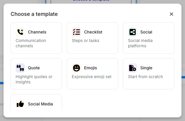
Open the dropdown to see the templates available in your account. The default set is **Channels**, **Checklist**, **Social**, **Quote**, **Emojis**, **Single**, and **Social Media**, and your account may have more.

<figure><img src="/files/LSgXImdU3i2aPFNH2QGN" alt="The Select icon template dropdown open on an icon card, listing seven templates: Channels, Checklist, Social, Quote, Emojis, Single, and Social Media, each with a small icon to its left."><figcaption><p>The Select icon template dropdown</p></figcaption></figure>

The template sets the card's starting icons, colours, and layout. Everything it gives you can be changed on the card afterwards, so pick the template closest to what you need and adjust from there.

{% hint style="info" icon="compass" %}
To build or change the templates this dropdown offers, see [How to use icon templates](/account-and-team/customization/how-to-use-icon-templates.md).
{% endhint %}

***

#### How to customise the icons on a card

Open the card details panel to change which icons appear and how they look. Click **Show card details** on the toolbar, or double-click the card.

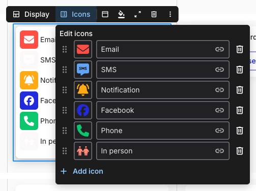
<figure><img src="/files/zKsS5Ag2fk8BIfEOSAAi" alt="The card details panel for an icon card. Six icon rows are listed, each with a drag handle, an icon, a colour swatch, a label field (Email, SMS, Notification, Facebook, Phone, In person), a link icon, and a delete icon. Below them, a + Add Icon link, then Direction with a selected down-arrow and a right-arrow option labelled max 15 icons, a Size dropdown set to Medium, and an Interactive dropdown set to Yes."><figcaption><p>Card details panel for an icon card</p></figcaption></figure>

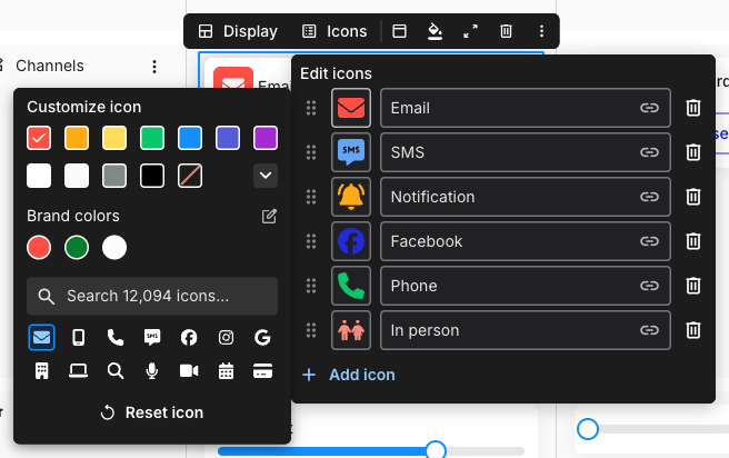
Each icon sits in its own row. From left to right, a row has a drag handle to reorder it, the icon, a colour swatch, a label field, a **link** icon to point the icon at a URL, and a delete icon to remove the row. Edit the label inline and changes save as you go.

To add an icon, click **+ Add Icon** and a new row appears at the bottom. A card holds up to 15 icons.

Below the rows, three settings control how the whole card displays:

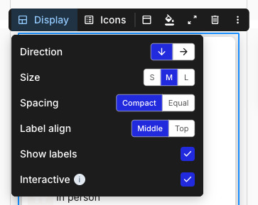
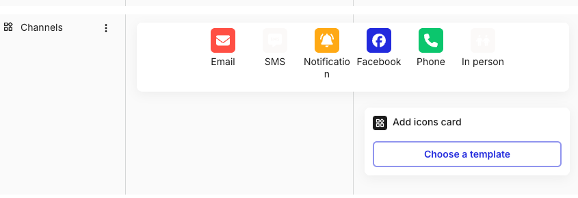
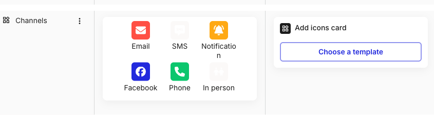
* **Direction** - lay the icons out in a column (down) or a row (right).
* **Size** - the icon size, set to **Medium** by default.
* **Interactive** - when set to **Yes**, anyone with edit access can click an icon on the map to toggle it on or off, and the on/off state is shared with everyone viewing the map. Set it to **No** to keep the icons fixed.

***

#### What icon cards share with other cards

The icon card toolbar carries the shared tail only: the **fill** control for colour and background, **Card header**, **Show card details**, delete, and the three-dot overflow menu. There are no text-formatting buttons, since an icon card holds icons rather than editable text.

<figure><img src="/files/j2ZW77v5e6yBO4s2BL1P" alt="The floating toolbar above a selected icon card, showing five controls: a card header icon, a paint-bucket fill icon, a show-card-details icon, a delete icon, and a three-dot overflow menu."><figcaption><p>The toolbar on a selected icon card</p></figcaption></figure>

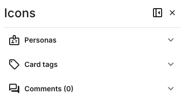
The card details panel also holds the universal **Personas**, **Card tags**, and **Comments** sections below the icon settings. For the toolbar tail, the colour and background picker, the card header, spanning, and multi-select, see [How to add and edit cards](/journey-maps/cards/how-to-add-and-edit-cards.md).

***

#### Related topics

<table data-column-title-hidden data-view="cards"><thead><tr><th>Title</th><th>Description</th><th data-hidden data-card-target data-type="content-ref">Target</th></tr></thead><tbody><tr><td><strong>How to use icon templates</strong></td><td>Build and edit the icon templates that the Select icon template dropdown offers, at the account level.</td><td><a href="/pages/slsfRG28ukTuwANdbWJw">/pages/slsfRG28ukTuwANdbWJw</a></td></tr><tr><td><strong>How to add and edit cards</strong></td><td>Parent how-to for shared card mechanics: toolbar, details panel, colours, and headers.</td><td><a href="/pages/DI00pTOdaJmOwltHKgIa">/pages/DI00pTOdaJmOwltHKgIa</a></td></tr><tr><td><strong>How to add and manage lanes</strong></td><td>Add a lane to hold your icon cards, or any other lane type.</td><td><a href="/pages/cEW7pumNPGKdJ65EEAz7">/pages/cEW7pumNPGKdJ65EEAz7</a></td></tr><tr><td><strong>How to bulk edit cards</strong></td><td>Select multiple cards and apply tags, personas, or colours in one go.</td><td><a href="/pages/D239Y2x0Gzcz0VuWHA1p">/pages/D239Y2x0Gzcz0VuWHA1p</a></td></tr><tr><td><strong>How to comment on a card</strong></td><td>Add comments and @mention teammates on any card from its details panel.</td><td><a href="/pages/Kk7GjJu76NovaA8LF2EL">/pages/Kk7GjJu76NovaA8LF2EL</a></td></tr></tbody></table>


---

# Agent Instructions
This documentation is published with GitBook. GitBook is the documentation platform designed so that both humans and AI agents can read, navigate, and reason over technical content effectively. Learn more at gitbook.com.

## Querying This Documentation
If you need additional information that is not directly available in this page, you can query the documentation dynamically by asking a question.

Perform an HTTP GET request on the current page URL with the `ask` query parameter, and the optional `goal` query parameter:

```
GET https://helpdesk.smaply.app/journey-maps/cards/how-to-use-icon-cards.md?ask=<question>&goal=<endgoal>
```

`ask` is the immediate question: it should be specific, self-contained, and written in natural language.
`goal` is optional and describes the broader end goal you are ultimately trying to accomplish on behalf of the user. GitBook uses it to tailor the answer towards what is most useful for that goal.

The response will contain a direct answer to the question and relevant excerpts and sources from the documentation.

Use this mechanism when the answer is not explicitly present in the current page, you need clarification or additional context, or you want to retrieve related documentation sections.