For the complete documentation index, see llms.txt. This page is also available as Markdown.

How to use image cards

Add an image to a journey map, set how it sits in its card, and swap it out whenever you need a different visual.

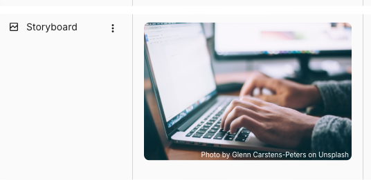
Image cards put a visual on the map: a storyboard frame, a screenshot, a photo of a research artefact, or anything that carries more than words can. Pick an image from Unsplash or Giphy or upload your own, then adjust how it fits the card.

A journey map lane labelled Storyboard holding an image card. The card shows a photo of a person typing on a laptop, with a small attribution credit in the bottom-right corner of the image.
An image card in a journey map lane

To add one, hover an empty cell and click + Add card, then choose Image. Image is the default in an Image lane (press Enter to confirm) and sits under BASIC CARDS in the picker in any other lane. The Add image chooser opens straight away so you can pick the image as you add the card.


How to choose an image for the card

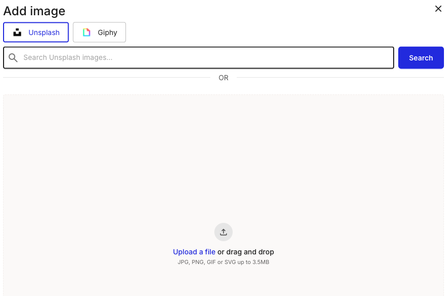
The Add image chooser gives you two built-in sources and an upload option. Unsplash and Giphy both work without a login, and the credit for a chosen image shows on the card automatically.

The Add image chooser with an Unsplash tab selected and a Giphy tab beside it. Below is a search field with a Search button, an OR divider, and an upload dropzone reading Upload a file or drag and drop, JPG, PNG, GIF or SVG up to 3.5MB.
Add image chooser: Unsplash, Giphy, or upload
1

Pick a source

Stay on the Unsplash tab for stock photography, or click Giphy for animated GIFs. To use your own file instead, skip to uploading below.

2

Search, or upload your own

Type a term in the search field and click Search to browse results from the selected source, then click an image to place it on the card. To use a local file, click Upload a file or drag and drop it onto the dropzone. Uploads accept JPG, PNG, GIF, or SVG up to 3.5MB.


How to adjust the way an image displays

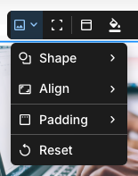
With an image card selected, the left-most button on the floating toolbar opens the image display options. Use them to control how the image sits inside the card without changing the image itself.

The image card toolbar with its left-most dropdown open, listing Shape, Align, and Padding (each with a submenu arrow) and a Reset action below them.
Image display options on the toolbar
  • Shape - crop the image to a preset shape: Original, Square 1:1, Portrait 3:4, Landscape 4:3, Circle, or Message.

  • Align - position the image within the card, vertically (top, center, bottom) and horizontally (left, center, right).

  • Padding - set the space around the image: None, Small, Medium, or Large.

  • Reset - restore the display settings to their defaults.

To see the image on its own, click Full screen on the toolbar (the icon beside the display-options dropdown). The same Full screen button sits at the top of the card details panel.


How to change the image

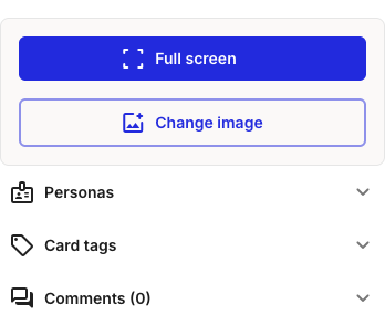
To swap in a different image, open the card details panel (click Show card details on the toolbar) and click Change image. This reopens the Add image chooser, where you pick a new image the same way you did the first.

The image card details panel showing a Full screen button and a Change image button at the top, followed by collapsed Personas, Card tags, and Comments sections.
Change image reopens the source chooser

What image cards share with other cards

The display options and Change image are what's specific to an image card. Everything else on it is shared with every other card type:

  • Accent colour, background style, and card header (the fill control and the buttons after it on the toolbar)

  • Card details panel for personas, tags, and comments

  • Duplicate, expand, shrink, and delete from the three-dot menu

  • Multi-select with Shift+click

See How to add and edit cards for the canonical walkthrough of these mechanics.


Last updated