For the complete documentation index, see llms.txt. This page is also available as Markdown.

How to use portfolio item cards

Show an opportunity, pain point, solution, or other portfolio item on a journey map, with its scores, priority, status, and assignee in view.

A portfolio item card puts one of your portfolio items, such as an opportunity, pain point, or solution, onto a journey map. The item itself is the data and lives in your workspace; the card is a view of it on the map, so editing the item updates every card that displays it.

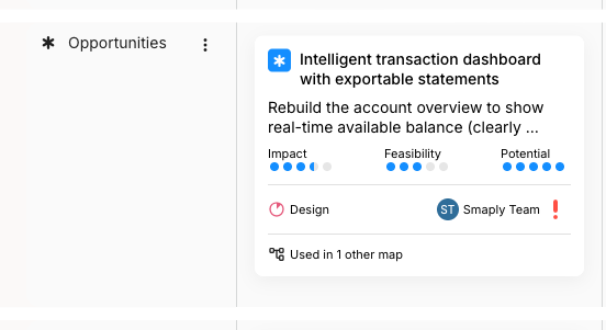
A portfolio item card in an Opportunities lane on a journey map. The card has a blue starburst icon, a title reading Intelligent transaction dashboard with exportable statements, a truncated description, three score meters labelled Impact, Feasibility, and Potential, a Design status with a priority marker, an assignee avatar, and a footer reading Used in 1 other map.
A portfolio item card shows the item's scores, status, priority, and assignee
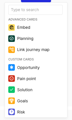
To add one, hover an empty cell and click + Add card, then pick the type you want from the CUSTOM CARDS group at the bottom of the picker. This account's types are Opportunity, Pain point, Solution, Goals, and Risk; your own list depends on the portfolio item types set up in your workspace. Adding the card places a view of an existing item on the map.

The Add card picker open with a Type to search box at the top. An ADVANCED CARDS group lists Embed, Planning, and Link journey map. Below it, a CUSTOM CARDS group lists Opportunity with a blue starburst icon, Pain point with a red icon, Solution with a green tick icon, Goals with a yellow trophy icon, and Risk with a purple question-mark icon.
Portfolio item types sit in the CUSTOM CARDS group of the picker
Portfolio item cards are limited to 3 per map on the Free plan. They are unlimited from the Repository plan and above.


What a portfolio item card shows

The card face surfaces the item's headline data so you can read it without opening anything: the item's title and type icon, a truncated description, the type's score dimensions as small meters, the priority and status, and the assignee. A footer line reads Used in N other map when the same item appears on other journey maps.

The score dimensions belong to the portfolio item type, so they differ from one type to the next. The opportunity above is scored on Impact, Feasibility, and Potential; a pain point in the same workspace might be scored on Impact, Reach, and Cost instead. The meters on the card are read-only; scores are set on the item, not on the card.


The portfolio item card toolbar

Select the card to open its floating toolbar. A portfolio item card has no text-formatting controls, since its content comes from the item rather than from typing on the card.

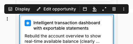
A selected portfolio item card with a blue selection border and its floating toolbar above. The toolbar shows, from left, a Display button with a panel icon, an Edit opportunity button with a pencil icon, then a card header icon, a fill paint-bucket icon, a show card details icon, a delete icon, and a three-dot overflow menu.
The toolbar adds Display and Edit [type] ahead of the shared controls
Two controls are specific to this card type, on the left of the toolbar:

  • Display - sets how much of the item the card shows on the map. See How to change what the card displays below.

  • Edit [type] - opens the underlying item for editing. The button is named for the item's type, so it reads Edit opportunity for an opportunity, Edit pain point for a pain point, and so on. Changes you make there update every card that displays the item.

Everything to the right of these (card header, fill colour, show card details, delete, and the three-dot menu) is shared with every card type and is covered in How to add and edit cards.


The portfolio item details sidebar

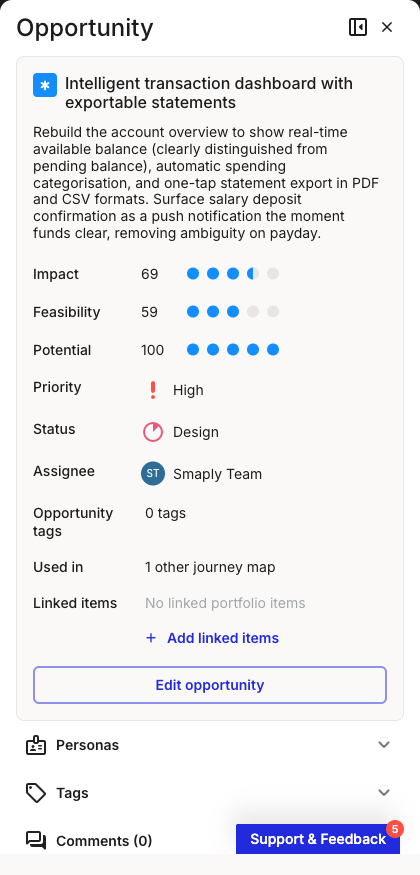
Open the card's details sidebar from Show card details on the toolbar, the three-dot menu, or by double-clicking the card. The panel header names the item's type, and the top of the panel holds the item's data.

The card details sidebar for a portfolio item, headed Opportunity. From the top: the item title with its blue icon and full description, then Impact 69, Feasibility 59, and Potential 100 as labelled score meters, then Priority High, Status Design, an assignee row, Opportunity tags reading 0 tags, Used in 1 other journey map, and a Linked items row reading No linked portfolio items with a plus Add linked items link. An Edit opportunity button sits below, followed by collapsed Personas, Tags, and Comments sections.
The details sidebar carries the item's full data above the shared sections
The type-specific rows, top to bottom:

  • Scores - the type's score dimensions with their numeric values and meters (here Impact, Feasibility, and Potential).

  • Priority - the item's priority, with its marker.

  • Status - the item's workflow status, with its status ring.

  • Assignee - the person the item is assigned to.

  • [type] tags - tags set on the item itself, separate from the card tags below. These read Opportunity tags for an opportunity, and so on.

  • Used in - how many other journey maps display this same item.

  • Linked items - portfolio items linked to this one. Use + Add linked items to connect another item, for example a solution that addresses this opportunity.

  • Edit [type] - the same edit action as on the toolbar, opening the item for changes.

Below these, the panel carries the Personas, Tags, and Comments sections that appear on every card. Those, and the shared toolbar controls, live in How to add and edit cards.

The fields here are a read-only view of the item. To change a score, priority, status, assignee, or the item's own tags, open the item with Edit [type]. Editing it updates every card that displays it, on this map and any other.


How to change what the card displays

The Display control sets how much of the item the card shows, so you can keep a map readable when several portfolio items sit on it.

1

Select the card and open Display

Click the card to open its toolbar, then click Display.

2

Pick a display mode

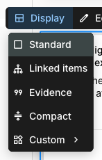
Choose one of the modes from the menu. The card redraws on the map immediately.

The Display menu open from a selected portfolio item card's toolbar. It lists Standard, Linked items, Evidence, Compact, and Custom, with Custom showing a submenu arrow on the right.
The Display menu sets how much of the item the card shows

The modes are Standard, Linked items, Evidence, Compact, and Custom. Standard is the full face shown above, including the Used in indicator. Compact shrinks the card to its title and key markers. Custom opens a submenu for choosing which parts of the item to show.


Where portfolio items come from

Portfolio item cards display items you have already created; they don't create the items. The item, its type, and its scores all live in the workspace's Portfolio. For those tasks, start here:


Last updated