For the complete documentation index, see llms.txt. This page is also available as Markdown.

How to use text cards

Write narrative notes, descriptions, and explanations on a card, then format the text with bold, colour, alignment, lists, and your choice of font.

Text cards are the free-form cards you type narrative into: descriptions, notes, and explanations that sit alongside the steps of a journey. They are the default card in a Text lane and in Grid cells, and the on-card toolbar gives you the full set of text-formatting controls.

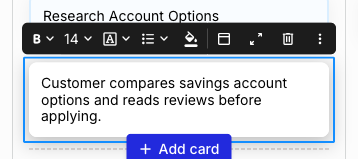
A selected text card reading Customer compares savings account options and reads reviews before applying, with a blue selection border and a floating formatting toolbar above it showing bold, font size 14, a boxed A menu, list, fill colour, card header, card details, delete, and a three-dot menu.
A selected text card with its formatting toolbar
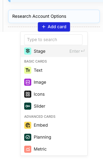
To add one, hover an empty cell in any lane and click + Add card. Text is the default in a Text lane (press Enter to confirm) and sits in the BASIC CARDS group of the picker in any other lane, marked with a green TT icon.

The Add card picker open below a Research Account Options card, with a search box reading Type to search, a highlighted quick-select row, and a BASIC CARDS group listing Text with a green TT icon, Image, Icons, and Slider, followed by ADVANCED CARDS.
+ Add card picker, Text under BASIC CARDS
How to edit the text on a card

Click into the card and type. Text cards edit inline, so what you type is the card's content, and changes save as you go without a Save button. Click out of the card or into another to finish.

Pasting works two ways, and they behave differently. Paste into a card's text editor and any incoming formatting is cleared, so the text matches the card. Paste into a lane and the content fans out into multiple cards across the lane instead, one per row or line, which is how you turn a spreadsheet or a list into cards in one go. For that path, see How to use enhanced paste.


How to format the text in a text card

With a text card selected, the floating toolbar above it carries the formatting controls. Left to right: B for bold, the font size, the boxed A menu, a bulleted list, and the fill (paint bucket) for the card's colour and background. The controls to the right of the fill (card header, card details, delete, and the three-dot menu) are shared with every card type and are covered in the parent article.

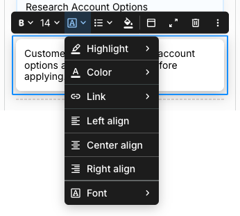
The boxed A opens the rest of the text formatting in a single menu:

The boxed A menu open on a selected text card, listing Highlight, Color, Link, Left align, Center align, Right align, and Font, each of the first three and the last showing a submenu arrow.
The boxed A menu holds highlight, colour, link, alignment, and font
  • Highlight - apply a highlight colour behind the text.

  • Color - set the text colour.

  • Link - turn selected text into a link.

  • Left align, Center align, Right align - align the text in the card.

  • Font - choose the font for the text.

Use the toolbar's font-size control and the B bold button alongside these. The bulleted list control and the fill sit directly on the toolbar rather than in this menu.

The card's accent colour and background style are set with the fill control and are shared across card types, so they are covered in the parent article. A text card also takes its colour from its lane, which you set on the lane itself.


How to format many text cards at once

To format more than one card together, select the cards, then filter the selection to Text. With the selection narrowed to text cards, styling and text-formatting actions apply to all of them at once.

A bulk-selection filter menu listing card types with counts (Text 4, Image 2, Icons 1, Slider 1, Pain point 1, Opportunity 1) above a bulk-action bar showing Filter 10 items, Tags, Persona, and Delete.
Filter a multi-card selection to Text to format them together
See How to bulk edit cards for the full bulk-selection flow.


How to span a text card across columns

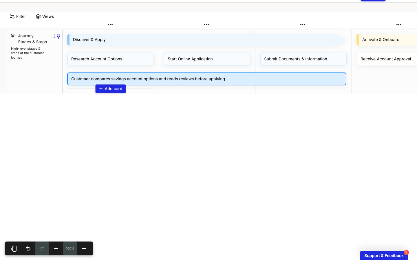
A text card can stretch across more than one column, which is useful for labelling a process or phase that runs over several steps, for example a process bar in a Grid lane. Select the card, open the three-dot menu, and click Expand to grow it one column at a time; Shrink pulls it back and stays greyed out until the card spans more than one column. The keyboard shortcuts are the Right arrow to expand and the Left arrow to shrink.

A text card reading Customer compares savings account options and reads reviews before applying, selected and spanning the three step columns of the Discover and Apply stage in a journey map editor.
A text card spanned across three step columns
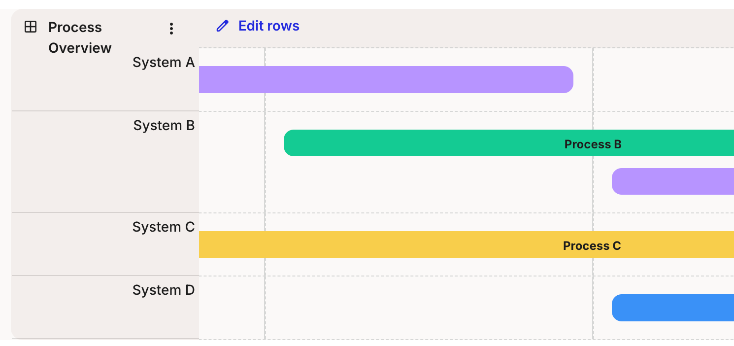
In a Grid lane, spanned text cards are how you build horizontal process bars across the grid.

A Grid lane titled Process Overview with rows System A to D and text cards spanned horizontally across columns to form coloured process bars, including a green bar labelled Process B and a yellow bar labelled Process C.
Grid lane: processes made of spanned text cards

For the lanes and columns that text cards span, see How to use grid lanes and How to add and manage lanes.


What text cards share with other cards

Text cards use the same toolbar tail, card details panel, and colour system as every other card type. The defining feature of a text card is the text formatting above; the rest is shared:

  • Accent colour, background style, and card header (the fill control and the controls after it)

  • Card details panel for personas, tags, and comments

  • Duplicate, expand, shrink, and delete from the three-dot menu

  • Multi-select with Shift+click

See How to add and edit cards for the canonical walkthrough of these mechanics. Inline editing is shared with stage cards; see How to use stage cards.


Last updated