How to choose a metric type
Pick Series, Number, or Comparison so your data lands on the card in the shape that tells your story.
Last updated
Pick Series, Number, or Comparison so your data lands on the card in the shape that tells your story.
The type you pick decides how a metric's data is shaped and how it renders on a card. You choose it from the Type dropdown in the metric builder, after you name the metric and pick a source. For the full build flow, see How to create and configure a metric.

There are three types. Match the type to the question your data answers.
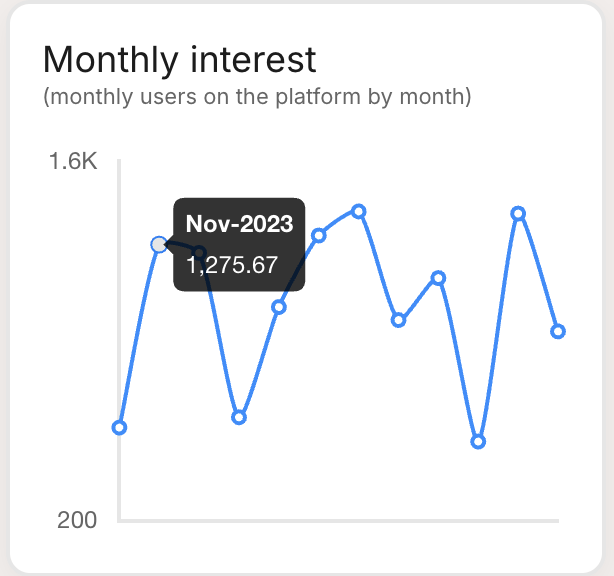
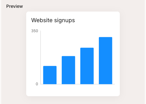
A sequence of data points, such as monthly signups or responses broken down by category. Pick Series when you have many values to plot and you want to show a trend over time or a breakdown across categories.
Series data renders as a Bar, Horizontal bar, Pie, Line, or Table chart, chosen in the card options. A line chart suits a trend over time; bars and pie suit category breakdowns; a table suits exact figures.

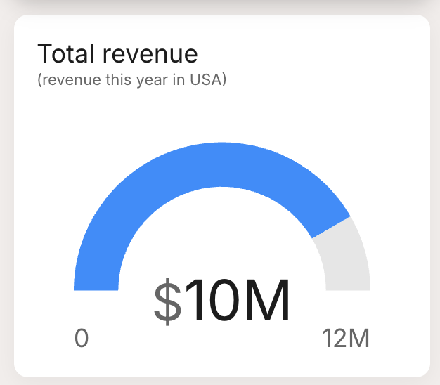
A single standalone value, such as current CSAT or total revenue. Pick Number when you want to spotlight one headline figure.
A Number renders either as the value on its own, or as a semi-circular gauge that shows the value against an optional target. Use the gauge when the figure is most meaningful relative to a goal.

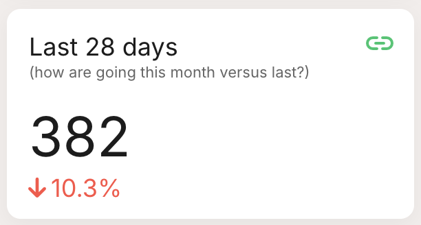
Two values contrasted, such as this quarter against last. Pick Comparison when the story is the change between exactly two figures.
A Comparison renders as a value with a percentage-change line below it, or as two bars side by side. The percentage line shows the direction and size of the change at a glance.

Series
Number
Comparison
Best for
Trends over time or category breakdowns
One headline figure
The change between two values
Data shape
Many data points
A single value
Exactly two values
Renders as
Bar, horizontal bar, pie, line, or table
A value or a gauge against a target
A value with a percentage change, or paired bars
The type also sets which render options are available: Series gives you the five chart types, Number gives you the value or gauge, and Comparison gives you the percentage line or paired bars. You can change the render in the card options at any time. Once a type fits, build the metric in How to create and configure a metric.

Last updated