For the complete documentation index, see llms.txt. This page is also available as Markdown.

How to use the portfolio summary

See every portfolio item's volume, status, priority, and ownership at a glance, then jump straight into prioritization.

The Summary is the first thing you see when you open Portfolio: one card per item type, each showing how many items you have, who owns them, and where they sit on status and priority. From here you move into the prioritization views to work item by item.

How to open the portfolio summary

Click Portfolio in the workspace sidebar to open the Summary.

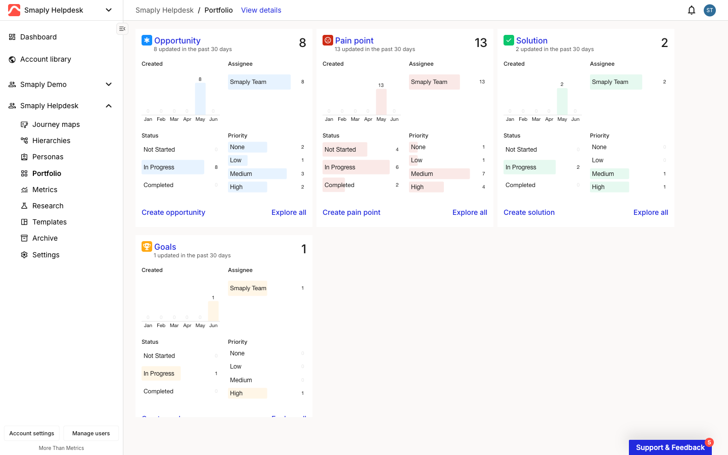
A Smaply workspace with Portfolio selected in the left sidebar. The Summary dashboard fills the page as a grid of cards, one per portfolio item type: Opportunity, Pain point, Solution, and Goals. A View details link sits at the top.
Portfolio selected in the sidebar, showing the Summary

The Summary shows one card per item type in the workspace: the three built-in types (Opportunity, Pain point, Solution) plus any custom type your account has added, like Goals. It covers every portfolio item across all journey maps in the workspace, not just the ones on a single map.


What each type card shows

Each card is a read-at-a-glance breakdown of one item type. The header gives you the type name and the total count, with a line below it telling you how many items changed in the past 30 days, so you can spot whether a type is active or stale.

Close-up of the Opportunity card on the portfolio Summary. The header shows the Opportunity name and a total count of 8, with 8 updated in the past 30 days below it. A Created bar chart spans Jan to Jun. An Assignee breakdown lists Smaply Team. A Status breakdown groups items into Not Started, In Progress, and Completed. A Priority breakdown lists None, Low, Medium, and High. Create opportunity and Explore all links sit in the footer.
One type card: counts, creation trend, and breakdowns

Below the header, four breakdowns answer the questions you usually open the portfolio to ask:

  • Created - A monthly bar chart of when items of this type were added over the past six months, so you can see whether the type is growing or went quiet.

  • Assignee - Who owns the items, with a count each. Use it to check workload and spot unassigned work.

  • Status - Items grouped into Not Started, In Progress, and Completed, for a quick read on how far along the type is. Each type can have its own named statuses, which roll up into these three categories.

  • Priority - Items split across None, Low, Medium, and High, so you can see how much high-priority work is outstanding.

Each breakdown segment is clickable: selecting one, like an assignee's name or the High priority bar, opens the prioritization views filtered to that selection.

The footer has two links: Create [type] (for example, Create opportunity) opens the create modal for that type, and Explore all opens the prioritization views filtered to that type.


How to move into the prioritization views

The Summary is for scanning. To work item by item, open the prioritization views, where the same items appear in three layouts you switch between.

  • View details in the breadcrumb header opens the views with everything included.

  • Explore all on any type card opens the same views filtered to that one type.

Both land you on the same screen, where a switcher in the top-right toolbar moves between the three views:

To return to the dashboard, click Back to summary in the breadcrumb.

Last updated