For the complete documentation index, see llms.txt. This page is also available as Markdown.

How to use the portfolio chart

See your whole portfolio prioritized at a glance, with the highest-impact, most-feasible items grouped together.

The Chart view plots every portfolio item as a bubble on your score dimensions, so the work that scores high on both axes lands in one corner and the rest sorts itself out around it. It's built for workshop-style prioritization.

How to open the Chart

The Chart is one of three views (Table, Board, Chart) that share the portfolio views screen. The screen remembers the view you used last, so you may land on the Chart already.

1

Open the portfolio views screen

Click Portfolio in the workspace sidebar to open the Summary, then click View details in the header or Explore all on any type card.

2

Switch to the Chart

In the Table / Board / Chart switcher at the top right of the toolbar, click Chart.

The portfolio view switcher, a segmented control with Chart selected and labelled, and Table and Board as icon-only toggles.
Table / Board / Chart switcher, Chart active
How to read the chart

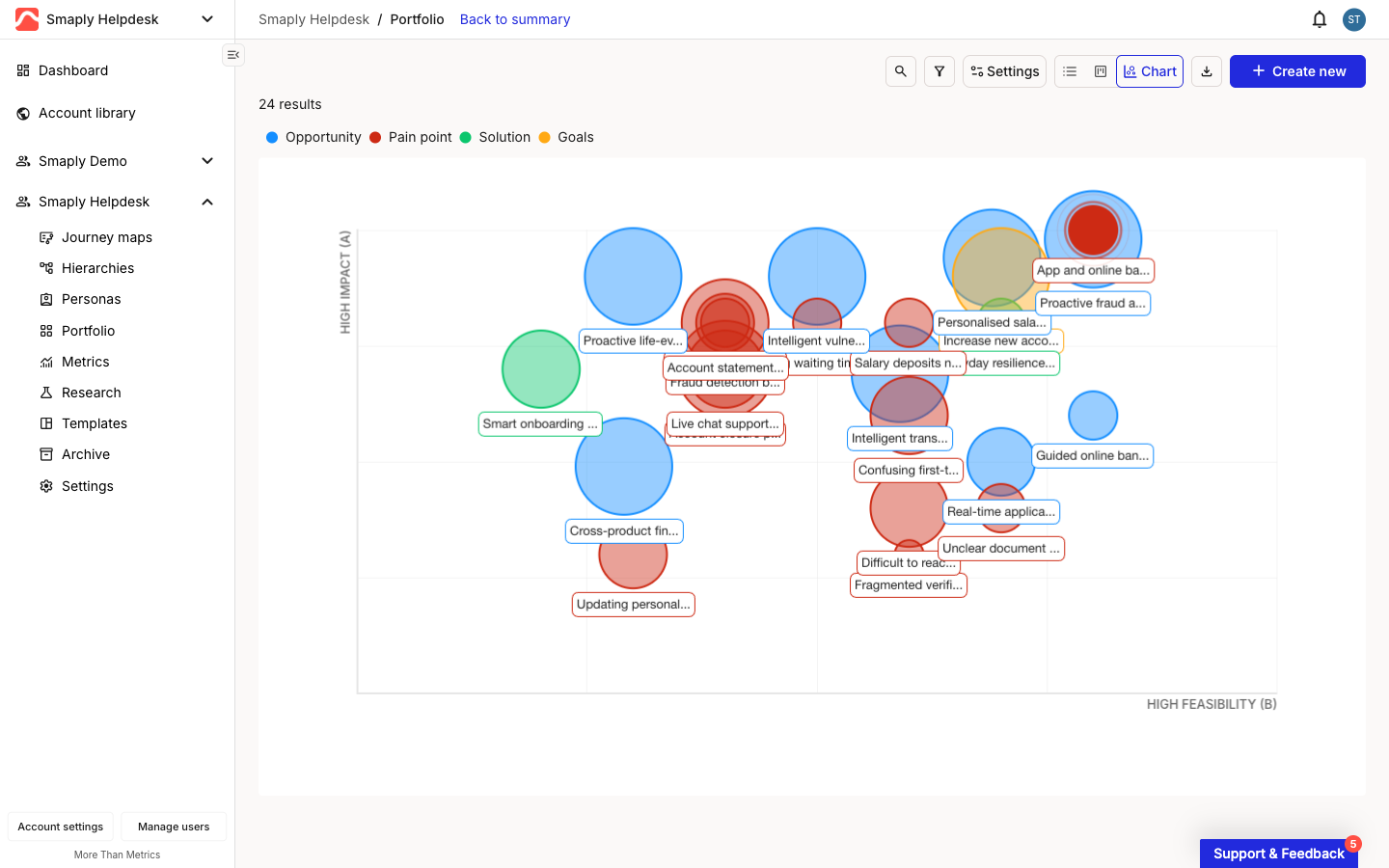
Each bubble is one portfolio item. Three things encode its scores:

  • Position - the two axes are your first two score dimensions. In the example below they're HIGH IMPACT (vertical) and HIGH FEASIBILITY (horizontal), so an item sitting top-right scores high on both and is a strong candidate to prioritize. Your axis labels depend on the score dimensions your workspace uses.

  • Colour - by default, the bubble's colour is its item type, keyed by the legend across the top: Opportunity blue, Pain point red, Solution green, and any custom types your workspace has added (here, Goals in yellow). You can recolour by status or priority instead, covered below.

  • Size - the bubble's size is a third score dimension, so a large bubble scores higher on that dimension than a small one.

The portfolio Chart view. Bubbles of different colours and sizes are plotted against a vertical HIGH IMPACT axis and a horizontal HIGH FEASIBILITY axis, each labelled with its item name. A legend across the top maps colours to types: Opportunity blue, Pain point red, Solution green, Goals yellow.
The Chart view, with bubbles plotted by score
Where bubbles overlap, they stack and each keeps its name label, so a cluster in one corner stays readable.

How to adjust the display and filter the chart

Two controls on the toolbar change what the chart shows.

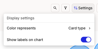
Settings opens the Display settings dropdown. Color represents sets what the bubble colours mean: Card type (the default, matching the legend), Status category, or Priority. Switch it to colour the same bubbles by where items stand or how urgent they are, without changing their positions. Show labels on chart toggles the item-name labels on or off, which is useful when a dense chart gets crowded.

The Display settings dropdown open from the Settings button. It shows Color represents set to Card type, and a Show labels on chart toggle switched on.
Settings > Display settings
The Display settings menu with the Color represents submenu expanded, listing Card type, Status category, and Priority, with Card type selected.
Color represents: Card type, Status category, or Priority

The axes themselves are fixed to your first two score dimensions and are not reconfigurable from the chart.

The filter icon narrows the chart to a subset of items by Journey map, Type, Status, Priority, Assignee, and more. Filters combine, so you can focus a workshop on, say, high-priority pain points for a single journey map. To pull the same data into a spreadsheet, switch to the Table view and export from there. See How to export portfolio to CSV.

Last updated