Loading...
Loading...
Loading...
Loading...
Loading...
Loading...
Loading...
Loading...
Loading...
Loading...
Loading...
Loading...
Loading...
Loading...
Loading...
Loading...
Loading...
Loading...
Loading...
Loading...
Loading...
Loading...
Loading...
Loading...
Loading...
Loading...
Loading...
Loading...
Loading...
Loading...
Loading...
Loading...
Loading...
Loading...
Loading...
Loading...
Loading...
Loading...
Loading...
Loading...
Loading...
Loading...
Loading...
Loading...
Loading...
Loading...
Loading...
Loading...
Loading...
Loading...
Loading...
Loading...
Loading...
Loading...
Loading...
Loading...
Loading...
Loading...
Loading...
Loading...
Loading...
Loading...
Loading...
Loading...
Loading...
Loading...
Loading...
Loading...
Loading...
Loading...
Loading...
Loading...
Loading...
Loading...
Loading...
Loading...
Loading...
Loading...
Loading...
Loading...
Loading...
Loading...
Loading...
Loading...
Loading...
Loading...
Loading...
Loading...
Loading...
Loading...
Loading...
From the Account settings page, click on the "Integrations" section and then click 'Set up' or 'Edit' on the "Office 365 Excel" integration.
See detailed instructions:
You can copy entire lanes — including all their content — across different journey maps, even between workspaces or accounts.
Copy a lane Open the lane menu (the three-dot menu in the lane header) and select Copy lane.
Paste it anywhere Go to any journey map — it can be in the same workspace or another one — and press CMD + V (Mac) or Ctrl + V (Windows).
Choose where to paste A banner will appear at the bottom of your screen. Use the dropdown to select under which lane you’d like to paste your copied lane.
Tailor your journey map to match your workflow or presentation needs with the filter and view options.
Instead of overwhelming visuals, focus on specific lanes or personas by utilizing the filter function. Filters and saved views can enhance collaboration and presentation.
Saved views are accessible by anyone who has access to the map and can be shared with the team via URL. You can see the name of a saved view right behind the journey title.
Customize your experience with as many different views as your workflow requires.
You can invite people to a journey map, even if they are not part of your workspace or account.
Click the Share icon in the top menu of the journey editor, or open the three-dot menu in the journey map list and select "Share".
In the "Manage user access" section, enter the email address of the person you want to invite.
Choose their permission level (Admin, Editor or Viewer).
Click Invite.
All journey maps shared with a user appear on their dashboard under the "Shared from outside" section.
Welcome to the Smaply Helpdesk! Here, you'll find everything you need to make the most out of Smaply. From step-by-step guides and feature explanations to troubleshooting tips and best practices, our helpdesk is your go-to resource.
Whether you're just getting started or looking for advanced tips, explore the categories to find answers, tutorials, and insights that help you navigate and excel in journey management with Smaply.
Account Library: manage and reuse key content – journey maps, personas, opportunities, pain points, solutions, and metrics – across all workspaces within your account
Smaply Classic Import Tool: Classic users can now automatically migrate their maps into Smaply 3.0.
Customizable portfolio items: allowing teams to customize opportunity, pain point, and solution representations to their workflows
Copy and paste lanes between journey maps
New onboarding assets: Upon creating a new account, users will see demo personas, portfolio items and metrics in their account.
PDF export: Portfolio item summaries can be added via journey map export modal.
Portfolio:
Added an updated date filter and “Last Updated” column to portfolio tables for better tracking of recent changes
To switch between your personal and organization account – or if you have multiple shared accounts – use the menu at the bottom of the main sidebar menu. See how:
Smaply offers an organized way to manage your journey maps, personas, metrics, and portfolio through intuitive tables. Here’s an overview of what you can do in each section:
Search and filter: Quickly locate specific table items by applying filters or using the search bar.
Save views: Create and save customized table views with specific filters for yourself or your team.
Sort: Arrange table items by name, creation date, or other criteria.
Favorite: Mark journey maps, templates and saved views as favorites for quick access from your dashboard.
Duplicate journey maps, templates or personas to use them in other workspaces for collaboration or organization.
Update multiple items simultaneously to save time and streamline workflows.
Export your journey maps in Smaply with just a click.
Navigate to the top-right corner of the journey map or editor and hit the download icon. This PDF export includes the journey map info section.
Select what you want to export
Stay on the page until exporting is complete.
Here you find some screenshots of what your journey map in Smaply could look like. Use these in your presentations to negotiate budget and buy-in.
This article focuses on the Portfolio matrix, how to use it, and what personalization features it offers.
In the matrix, you can see the various pain points, opportunities, and solutions created in the journey maps of your workspace.
Here you see the overview of what the matrix looks like. You can filter, choose a different view, and download as a CSV. There is a legend on the right-hand edge that indicates the colors of the circles.
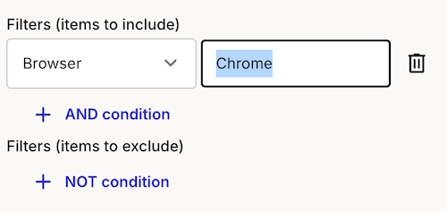
Filtering helps you quickly find relevant items in your Journey Map, Portfolio, Metric and Persona lists. You can filter by multiple criteria, such as creator, tags, or last updated date, to refine your search.
Different filter criteria (e.g., creator, tags, status) always combine with AND.
Learn about persona creation and how to apply them in your journey maps
There are two ways to create personas: either from the dashboard or from within a journey map.
-> click on Personas in the navigation and then on + Create persona in the top right.
Here, you can edit persona details such as the name, the layout and add relevant sections from our persona template. Once you click
Get detailed instructions on how to set up your Google Analytics integration with an OAuth Authentication.
Recommended Approach
For enterprise use cases, we recommend using a instead of OAuth. Service Accounts provide more secure and scalable access to Google Analytics data. However, if you prefer OAuth or have specific requirements, follow the steps below.
A Google account with access to the desired Google Analytics properties
AI on the Free plan: AI journey map creation is now available on the free plan, with 3 uses per user per month.
Copy & Paste Grid Lanes: Move entire lanes between maps to speed up reuse and iteration.
Performance improvements: Faster loading experience, especially for big journey maps and portfolios.
🚀 Get started with Smaply
Create or join an account
👣 First steps
Start your first project
🕵️♀️ Explore features
Check out the editor
Invite users directly to a map
HTML sharing of journeys
Click the "Connect to Google Analytics" button in Smaply
You will be redirected to Google's OAuth consent screen
Sign in with your Google account (if not already signed in)
Review the permissions requested by Smaply
Click "Allow" to grant access to your Google Analytics data
After granting permissions, Smaply will automatically check:
If your account has access to any Google Analytics properties
The list of properties you have access to
Your permission level for each property (e.g., Read & Analyze, Edit, Manage Users, etc.)
Note: Ensure you're using a Google account that has the necessary permissions for the Google Analytics properties you want to integrate with Smaply.
If you encounter issues during the OAuth process or property verification:
No properties available: Ensure your Google account has access to at least one Google Analytics property
Insufficient permissions: Check your access level in Google Analytics. You need at least "Read & Analyze" permissions for the properties you want to integrate
OAuth errors: Try clearing your browser cache and cookies, then attempt the process again
Token Expiration: OAuth tokens have an expiration period. Smaply will handle token refresh automatically, but ensure you don't revoke the app's permissions in your Google account to maintain uninterrupted access.
Portfolio performance boost
PDF downloads for library portfolio items


Note: Changes made during this time might be included in the export. So, if you don't want to change anything, make sure you wait until your journey map is ready to download.


Card color options: Card background styles including white, light, solid, and transparent options for more flexibility
Drag card edges to span cards on Journey Maps:
New card toolbars: New universal card toolbar with simpler editing for Text, Stage, and Image cards
Enhanced invitation handling:
Invitation links no longer expire after 30 days, providing unlimited time for team onboarding
Smart Invitation Auto-Accept: When you have a pending invitation to an account/workspace/journey map and access it via direct link, the invitation is automatically accepted and you're redirected to the resource
Pending invitation banner appears when you have outstanding invitations, with quick access to notifications
Combined "Shared with me" and "Membership" pages with redesigned interface for better organization

Save Filters as a View for Tables: Organize your journey map tables with saved views. Create shared views for collaboration or private views just for yourself.
Bulk Edit for Journey Maps and Personas: Manage your data efficiently with bulk editing capabilities:
Archive, copy, or tag journey maps.
Archive and copy personas.
Tag and filter personas, portfolio items and metrics: Not only and filter for tags in journey maps and cards, but every item there is!
HTML Sharing of a journey map: Share a read-only version of your journey map with anyone via a public link.
Customizable scale-labels for Emotion chart lane: Customize the labels of your Emotion chart scale to better fit your use case - no longer limited to the default -2 to +2 range!
Select Workspaces for Google Analytics: You can now select for which workspaces you want to enable your Google Analytics integration, providing greater control and flexibility.
Icon card layout: We improved our icon card layout for lots of text and added a "quotes"-template
We are now saving your sort order of the tables in your dashboard

Once you've received an email invitation to any of the above, there are two options to accept it.
Make sure you're logged into your Smaply account. If you don’t have an account yet, see our "Sign up for a Personal account" article.
Click the "Join workspace/account" or "Access the journey map" link in the invitation email.
The new account or workspace will now be available in your Smaply dashboard. The new journey map will appear under "Shared with me"
Make sure you're logged into your Smaply account. If you don’t have an account yet, see our Sign up for Smaply article.
Navigate to your user icon in the top right corner of your dashboard.
Click on invitations in the dropdown menu
On the invitations page, accept the pending invitation(s)
Refresh your browser: After accepting, refresh your browser, and the new account/workspace will appear in your dashboard. Journey Maps will show up under "Shared with Me."
The journey map list by selecting Share from the three-dot menu.
Click Enable Sharing
Copy the link and share it with anyone who needs access.
Important: Keep in mind that anyone with the link can view your journey map.
Password-protected sharing
Add a password to your shared HTML journey maps, ensuring that only the right people have access. Available for our Governance and Framework plans.

Edit your journey title by simply double clicking it.
Next to the journey title, you find the dropdown that opens the journey info panel: add a description, a journey performance indicator, a journey coordinator or tags. The info panel also shows a summary of all the portfolio items used in this map, as well as their status.
To create a journey map, you can choose from different options:
Manually add lanes to your journey
Create a journey from one of yours or our templates

Filters & Condition Bar Integration: Improved filtering with the condition bar across all menus.
Main Menu Drawer Component: New drawer component for a cleaner interface.
Updated Smaply Logo: We’ve refreshed our logo to match our evolving brand.
Additional Verifications for Account Deletions: Enhanced modal with more safeguards for account deletion.
Increased Request Rate Limit: Boosted rate limit for better performance.
Metrics Enhancements: Added more customization for metrics display and comparisons.
Home Redirect: Clicking the Smaply logo will now always redirect you to the personal dashboard.
Tag Selection Improvements: We’ve improved the tag selection experience for a smoother, more intuitive process.
User List Sorting: The list of users in your organization is now sorted by name for easier navigation.
Portfolio Enhancements:
Interactive Portfolio Management: Added an interactive bubble chart and table for managing portfolio items
Styling Updates: Enhancements to the Portfolio Page’s styling make the design cleaner and more user-friendly.
Portfolio Item Dropdown: We’ve added a dropdown menu in the Create Opportunity button, allowing you to select between Opportunity, Pain Point, or Solution more efficiently.
Portfolio Item Modal Enhancements: The Create/Edit portfolio item modal has been improved for a more seamless experience when managing portfolio entries.

Smart portfolio create: we brought in smarter portfolio item creation to easily search for existing or create new opportunities, pain points and solutions.
Bulk actions: Select and manage multiple templates or archived journeys at once
Embed card - Video support: Embed videos from multiple sources
Improved view-only mode for journeys & templates + Improved viewer role permissions
Portfolio CSV export now respects filters

Manual selection – Hold Shift and click on multiple cards.
No matter what type of card you select, you can:
Add or remove tags
Add or remove personas
Delete the selected cards
When you filter your selection by card type, more bulk actions become available. Examples include:
Adding card headers
Applying styling and text formatting
Change the display type of portfolio cards
This helps you quickly adjust the look and structure of your map, especially when working with many cards at once
Filtering for portfolio cards is also possible. You can filter for only those in a specific journey map, for types, according to status, priority or assignee. You can combine these filters according to your needs.


Within the same filter criterion (e.g., multiple tags), you can choose between AND and OR operators.
Let’s say you want to filter journey maps by the tags “current-state” and “Level 0”:
Using OR – Shows maps that have either "current-state" or "Level 0."
Using AND – Shows only maps that have both "current-state" and "Level 0."
After clicking, select the workspaces where you want to copy your journey map. You can copy journey maps to other workspaces of the same account, or even to workspaces of other accounts, if you are a member of more than one account.
Note that external data such as personas, portfolio items, tags or metrics won't be copied along, but just the content that lives exclusively in your journey map.
You can copy personas separately, but you would need to assign to the copied map.
To copy any persona to another workspace, go to your dashboard and click the persona section. Then, click the three dots on the right side of the persona you want to copy and select "Copy to other workspace."
After clicking, select the workspaces where you want to copy your persona. After you copy, go to the workspace and click "Personas" to see the copied persona.
To copy any template to another workspace, go to your dashboard and click the templates section. There you can click the three dots on the right side of the template you want to copy and select "Copy to other workspace."
After you copy, go to the workspace and click "Templates" to see the copied template.
Portfolio edit full screen view: More room for descriptions of your opportunities, pain points etc.
Card header improvements: enable it directly when selecting the corresponding toolbar menu item; Improved visual consistency of card headers

1: From a journey map, either open the column menu or use the paste keyboard shortcut (Control V or Command V).
2: Either paste into the selected lane, or manually select the destination lane you'd like the content added to.
3: Your content will be added as new cards spread accross the lane. Once added you can rearrange as desired.
Display options for Opportunities, pain points, solutions cards in a journey map.
Embed Card Descriptions in Link View: Add context where it matters: You can now add descriptions directly in the link-only card view.
Filters and Views in the Journey Editor: Smarter filters, familiar look. The journey editor now matches the dashboard filter style—and you can save your default view.
Advanced image selection: More ways to add visuals: Upload, drag & drop, or pick from Giphy and Unsplash to enrich your journey maps.

CreateClick on the card you want to add a persona to
Open the card detail sidebar
Scroll down to the persona section
Click "Create new persona" or select an existing persona from the dropdown.
The persona appears in the bottom of your card as little icon

Go to the dashboard and click "templates," and then on the top right corner, click "Create a template."
When you click any of your templates within the "journey maps" section, this will automatically create a journey map from your template. Every time you want to create a journey map from your template, you can click one of your templates, and it will create a map for you.
Personal Dashboard: A new, personalized dashboard where users can view all of their accounts and workspaces at a glance, along with recent activity, shared journey maps, and more.
Account Home Page: Introducing a dedicated dashboard for shared accounts, making it easier to manage and access collective work.
Settings Pages Redesign: Settings are now organized into tabs for a more intuitive navigation experience.
Enhanced Tag Management:
Updated the color palette for tags and improved the visual design, creating a more cohesive look across the platform.
To improve organization, duplicate tags within a category are now blocked automatically, ensuring cleaner tag categorization.
Check out what we launched in March 2025!
New dashboard sidebar: We introduced an improved sidebar experience for easier navigation. You can now switch between your accounts by opening the menu through clicking the little arrow in the lower left corner of your screen.
Notification enhancements: See where you were mentioned, invited, or where your help is requested – all in one place.
: Say hello to seamless integrations! Embed cards from monday.com, Power BI, and Tableau directly into your journey map.
Streamlined modal for creating & : Creating planning and embed cards just got easier with a refreshed modal experience.
: Side panel now supports real-time metric updates
Updated card & lane menus: Improved UI for better usability.
Membership visibility on invitations page: Users can now view their memberships and leave accounts, workspaces, or maps as needed.
Hide deleted memberships: Personal account memberships are no longer shown on the memberships page—keeping things clean and relevant.
Here you learn about lanes, columns and different card types, and how some show a slight divergence in behavior.
Adding lanes or columns: Hover between two column or lane headers, and a blue plus-button will appear, allowing you to add new elements.
Managing lanes or columns: click the three-dot menu to move or delete lanes and columns.
For lanes, there are even more options:
All lanes and cards are of a specific type, such as text lanes, stage lanes, and more. You might not see all options, depending on what plan you're on.
Cards added to a lane will automatically have the same type as the lane. But the great thing is:
Use the Grid to build channels or tables of any kind. The Grid is made up of sub-lanes, also known as swim lanes, making it ideal for displaying channels, e.g. using the . You can place cards of any type into the Grid, providing a flexible way to organize and visualize different aspects of your journey map.
The Emotion chart is used to display the emotional journeys of either personas or non-personas. Emotions are represented as dots on a 5-point Likert scale ranging from -2 to +2 by default, these values are customizable. You can add as many emotional journeys to your chart as you like, allowing for detailed comparison.
Monthly subscriptions are now available
New sign ups now get a free 14-day trial
for journey map creation
Lane duplication functionality for faster map building
Collapsible : Restyled the journey info panel, as well as the sharing and export mode along with being able to take journey actions like cloning and archiving within the map.
Card color for icon, image and slider cards: Added color support for icon, slider, and image cards, improving customization and clarity in visual design
Better pasting into text editor: Clear the formatting when you paste into the text editor to prevent unwanted or unsafe content from being inserted
New loading experience in journey map
for portfolio, image, slider and icon cards
When signing up for Smaply, each user gets their own, forever free account.
Go to Smaply
Visit smaply.app and enter your email address to begin the registration process
Choose your sign-up method
You have three options to sign up for an account:
Password: Set a password and use it to log in
Email code: You’ll receive a code via email. Make sure to check your spam/junk folder or whitelist emails from @mail.smaply.app
Google/Microsoft Account: Use your existing Google or Microsoft account to sign up
You don't have to stick with your current choice. You can change it each time you log in. You only need to use the same email address.
If you are interested in the Repository, Framework or Governance plan, click on one of the purple upgrade-buttons in your dashboard or account settings. You will get redirected to the plan selection page.
If you need help, get in touch with us via [email protected]. We are happy to send you a tailored offer according to your needs, please also see our discount scheme:
There are volume discounts available, starting from 20 users on.
We offer discounts for projects with an educational purpose (schools and universities) NGOs, and public services.
You can also get a discount if you agree on sharing insights to your project and collaborating on a case study that is relevant to the Smaply community.
Educational institutions: up to 100% NGOs: up to 50% Public services: up to 20%
The discounts are applicable to all plans.
Creating journey maps with Smaply AI saves you a lot of time and manual labour, while you're still in control and can adapt at every step of the way.
When creating a new journey map you now have the option to do so with AI. This feature is available for all paid plans, and in the 14-day free trial.
Follow the steps below where the creation of a journey map with Smaply AI is described, or watch this video with Marc Stickdorn to see how it works.
Go to your dashboard and create a new journey map.
This will lead you to a field where you can enter the general description of the journey map you would like to create. There also are some examples to try out.
In the next step you can refine your journey's name and description. By clicking the blue box in the lower left area of the screen another option for description styles opens up, that lets you change the focus of your journey map.
Customize steps and stages in your journey. You can add, edit and change the order of steps and stages. It's also possible to add content by adding lanes. You have the option to select and deselect steps and stages, descriptions, emotion charts, storyboard images, channels and satisfaction sliders.
Smaply AI understands multiple languages, but by default gives you an English journey map. To get results in your preferred language, for example German, try adding to the journey description prompt "Generate the content in German".
Smaply AI then creates a journey map that you can continue working with.
If you'd rather not have this feature available, or your organization doesn't allow the use of AI you can simply disable it for your account.
Go to your Account settings, navigate to the tab "AI Features" and click the blue switch to disable it for your account.
You can now connect your portfolio items – pain points, opportunities, and solutions – to each other to create a meaningful network of insights and actions.
Journey management doesn’t stop at identifying a problem. Now you can explicitly connect pain points, solutions and opportunities, helping teams see dependencies and track progress across your portfolio.
You can link pain points, opportunities, and solutions to each other – as many as you need. Here's how to do it:
Double click a portfolio item card to open its card sidebar.
Click "Add linked items" (or View linked items, if there's already existing ones) to open the Link Tree.
Once you opened the Link Tree view, add or edit connected portfolio items, or explore these connections in detail by clicking the plus button, or hovering below any linked item.
You'll see the links you created as a pill connected to the card → Hover to see a quick overview
You also get to the link tree from the portfolio item edit-modal, including their statuses. In the example below, two opportunities are linked, of which one has the status "done" (green), and the other one is in progress (blue).
Switch the card display to Linked items: Change your card to display the links directly instead of the usual portfolio item detail.
Link counts in the table: See how many links each item has directly in the table view.
Open it from any of the above described locations
Add pain points, opportunities, or solutions from your workspace
See linked items per type, along with a status bar to track progress
Easily browse through all connections by clicking on "explore links" upon selecting a linked items.
This helps you visually navigate and manage complex relationships between challenges and responses.
These shortcuts help you navigate Smaply efficiently and improve your workflow.
CMD + Z
Undo
CMD + Y
Redo
+
Zoom in
-
Zoom out
This article gives a general overview of how to configure the integration, leads you to more detailed articles for Google OAuth or Google Service Accounts and explains how to add a property, dimension
From the Account settings page, click on the "Integrations" section and then click "Set up" or "Edit" on the "Google Analytics" integration.
See detailed instructions:
A property in Google Analytics represents a website, mobile application, or device from which you want to collect data. It's a container for the data collected from your online presence.
Select all properties you want to use with Smaply. Each property will be available to the users that create metrics using the Google Analytics integration. Each property has its own set of dimensions and metrics.
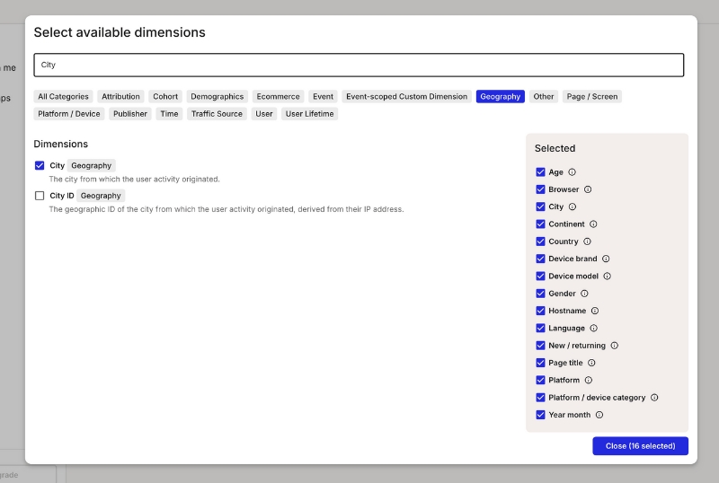
Dimensions are attributes of your data that are used to filter and group data in Smaply. They are made available to the users that create metrics using the Google Analytics integration.
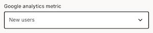
Metrics are the quantitative measurements of user activity on your site or app, such as the number of sessions, page views, or goal completions.
Click on the "Save" button to finalize your settings.
Congratulations! You have now configured the Google Analytics integration. You can proceed to create metrics with live data from Google Analytics.
Smaply offers bulk actions for journey maps and personas, making it easier to manage multiple items at once. Here's how to use them.
Select multiple items
Hover over the left side of a journey map or persona name in the respective list. A checkbox will appear.
Select multiple items by checking the boxes next to their names.
Access bulk edit menu
Once you've selected the items, a bulk edit menu will appear at the bottom of the screen with the following options:
Bulk add and remove tags: Apply or remove tags to/from multiple journey maps or personas at once.
Bulk copy to other workspaces: Copy selected journey maps or personas to other workspaces.
This guide explains how to set up OAuth authentication for Office 365 Excel integration with Smaply.
For enterprise use cases, we recommend using a Service Account instead of OAuth. Service Accounts provide more secure and scalable access to Office 365 data. However, if you prefer OAuth or have specific requirements, follow the steps below.
A Microsoft Office 365 account with access to the required Excel files.
Admin approval may be required for some organizations.
Click the Connect Office 365 Account button in Smaply.
You will be redirected to Microsoft's OAuth consent screen.
Sign in with your Microsoft Office 365 account.
Review the permissions requested by Smaply:
Read all files that you have access to
Sign you in and read your profile
No Files Available: - confirm that your Microsoft Office 365 account has access to at least one Excel file. Authentication errors:
Try clearing your browser cache and cookies, then restart the process.
If problems persist, contact your Office 365 administrator to verify account permissions.
OAuth tokens have an expiration period. Smaply will handle token refresh automatically, but ensure you don’t revoke the app’s permissions in your Microsoft account to maintain uninterrupted access.
If you need further assistance, reach out to Smaply support.
Apply filters and create view
Use the available filter options to customize your table view and cick on "Create view".
Name view and choose visibility
Name the view and decide whether it is for personal use (private) or visible to everyone in the workspace (shared). Note: Only admins can create views for everyone.
Favorite the view
Optionally, click the star icon to mark the view as a favorite. Favorited views will appear on the for quick access.
Save the view
Click "Save." The new view will now appear in the list of views above the filters.
Edit Views: Click the pen icon next to your saved views to rename, rearrange, delete or favorite them for better organization.
Update a View: Select an existing view, make changes (e.g., add/remove filters), and click "Update view" to save the modifications.
Self-service accounts: Users can now upgrade from a free trial to a paid plan directly in the app – no need to contact support.
Link view for embed cards: We've added a new link view to our , making it easier to display and access external content.
Card headers: Cards now support headers, so you can give each card a clear and meaningful title.
You can now see the highest plan you’re part of right in your personal account settings. Transparency FTW.
Signing in now takes you to your first account instead of your favorites. A little more intuitive!
The pricing page now shows the Free plan if you’re on it — makes it easier to compare and decide if it’s time to level up
This is an easy, click-by-click guide giving you orientation and showing you how to get started in Smaply.
CSV Export improvements: Including score names and values


Click Add Metric.
Enter a descriptive Name for your metric (e.g., "Employee Salary").
In the Source dropdown, select Excel (Office 365).
Choose the metric Type (e.g., Series).
Click Change to select an Excel file from your connected Office 365 account.
Select the relevant Sheet from the file.
(Optional) Check Make top row headers if your data has labeled columns in the first row.
Data Label: Choose the column that represents the category or labels for your metric (e.g., "Full Name").
Data Values: Select the numerical column that you want to use for the chart visualization (e.g., "Annual Salary").
(Optional) Select bottom rows if you want to pull data from the bottom of the sheet instead of the top. For example, selecting 10 rows from a sheet with 1,000 rows will take the last 10 instead of the first 10.
(Optional) Number of rows: Specify how many rows of data should be included (maximum of 50).
Review your selections to ensure the correct data mapping.
Click Save to generate the metric.
Your metric will now be visualized based on the selected data.
No data appearing? Ensure that the selected Excel sheet contains the correct headers and data.
Incorrect values displayed? Verify that numeric data is mapped under Data Values.
Can't connect to Excel? Check your Office 365 authentication and permissions.


UI text adjustments: Updated "View All" button text in dashboard section and adjusted account list item font size.
New & improved invite component: We’ve replaced the old invite user component with a sleek and nice invite component in organizations and workspaces.
Priority filter in portfolio: Need to focus on high-priority items? The new priority filter in portfolios helps you do just that.
Notification enhancements: You can now see pending invitations at a glance, and Smaply auto-scrolls to selected cards for smoother navigation.
Advanced filtering enhancements: UX fixes and improvements for lists
Updated tag UI: Improved tag styling in settings


Bulk archive: Archive multiple journey maps or personas at once.


Q: When does Smaply refresh metric data?
A: Smaply checks for updated metric data only when you open the metric section or access a map with a metric. If the data is over 1 hour old, it fetches the latest data. There’s no constant background refresh— updates happen on access to keep metrics current within about an hour.
Left arrow
Shrink card
CTRL + D
Duplicate card
Spacebar + Arrow up/down/left/right
View mode / Hand mode
ESC
Exit Hand mode
Backspace, delete
Delete card
Right arrow
Expand card
Left arrow
Shrink card
CMD + D
Duplicate card
Spacebar + Arrow up/down/left right
View mode / Hand mode
ESC
Exit Hand mode
CTRL + Z
Undo
CTRL + Y
Redo
+, CTRL + "+"
Zoom in
-, CTRL + "-"
Zoom out
Backspace, delete
Delete card
Right arrow
Expand card
Users on free plans can now assign tags to journey maps, although tag management remains a feature for paid plans only.
A user on the free plan can now only be assigned to one journey map per account, maintaining streamlined access and reducing user limitations.
(Optional) Consent on behalf of your organization
Click Accept to grant access to your Office 365 data.

A property in Google Analytics represents a website, mobile application, or device from which you want to collect data. It's a container for the data collected from your online presence.
Select all properties you want to use with Smaply. Each property will be available to the users that create metrics using the Google Analytics integration. Each property has its own set of dimensions and metrics.
Dimensions are attributes of your data that are used to filter and group data in Smaply. They are made available to the users that create metrics using the Google Analytics integration.
Metrics are the quantitative measurements of user activity on your site or app, such as the number of sessions, page views, or goal completions.
Click on the "Save" button to finalise your settings.
Congratulations! You have now configured the Google Analytics integration. You can proceed to create metrics with live data from Google Analytics.
Click New registration.
Set Supported Account Types to:
Accounts in this organizational directory only (Single tenant).
Search for the app you created in Step 1.
Navigate to Certificates & Secrets.
Under Client Secrets, click + New client secret.
Copy and save the generated Client Secret securely. You will need it later.
Go to API Permissions > Add a permission.
Choose Microsoft Graph.
Under Application permissions, add Files.Read.All.
Click Grant admin consent for Default Directory.
You will need the following details to configure the integration:
(A) Client ID
(B) Tenant ID
(C) Client Secret
🚀 Congratulations! You have successfully set up a service account for Office 365.
Now! Go to Smaply Integration Configuration
Ensure you have set up the Client Secret and API Permissions correctly in Azure.
Verify that you have granted admin consent for Microsoft Graph permissions.
Add more lanes: Hover between lanes to add new lane types such as opportunities, linked journey maps, grids, and many more. Get more details on lanes, columns, and cards.
Getting started is always the hardest part, and you did it! 🎉
Now, if you want to rename your journey map, add a description and tags, assign who is in charge, and select a Journey Performance Indicator, you can do so by clicking the journey info icon in the top right corner.
You can find our Helpdesk in the dropdown of your user icon in the top right corner.

Power BI integration and Office 365 Excel integration: Connect your metric cards to external data sources and keep your insights up to date.
Embed content into journeys: Add interactive elements to your journey maps with embedded content from Miro, Figma, YouTube, Google Sheets, Docs, Slides, Mural, and Microsoft Office files.
New persona card types: Expand your persona documentation with additional card options.
Advanced filtering for dashboard lists: Use AND and OR operators for multi-selection filters to refine your searches.
Metrics: duplicate and bulk delete: Duplicate metrics or remove multiple metrics at once.
Bulk edit for coordinator and Journey Performance Indicator: Save time by editing multiple journey maps at once, including coordinators and performance indicators.


All your journey content is organized in cards. Get an overview of all card types and learn about their functionalities and use cases.
All lanes and cards are of a specific type, such as text lanes, stage lanes, and more. You might not see all options, depending on what plan you're on. Read more about certain card types further down.
Cards added to a lane will automatically have the same type as the lane. But the great thing is:
For some card types like text or stage cards, you can simply click into the card and start typing. To keep it simple, we only added the main actions into the card toolbar.
In the card detail panel, you can add more detail to your cards. Depending on the card type there are different editing options. These options are the same for all card types:
Add personas
Add tags
Add comments
Double-click on a card to open the details panel.
You can add headers to your cards, giving you more flexibility in organizing and labeling your content. You can also add icons to it for identification at a glance.
Icon cards come with several templates to get you started. Use the icon template "Channels" to quickly create a set of channels that you can duplicate throughout your lane. Upon clicking on an icon, you can turn the channel on or off.
Smaply allows you to connect your journey maps using Link Journey Map cards. This helps you build hierarchies or networks of journeys, making it easier to manage and navigate complex experiences across different levels.
The Link Journey Map card lets you link another journey map from the same, or from another workspace directly into the card.
Once linked, the card will display:
The title of the journey
Its description
The performance indicator (if set)
The assigned coordinator
You can use Link Journey Map cards to:
Create high-level, end-to-end journeys that reference more detailed sub-journeys
Zoom into specific steps by linking a lower-level journey
Build a network of journeys to better reflect complex service structures
This setup enables you to structure your journey maps more strategically — from broad overviews to detailed processes.
Imagine you’re mapping an entire customer lifecycle. You can:
Build a high-level journey to visualize the full end-to-end experience
Link detailed journeys, like onboarding, support, or renewal, into individual steps
Allow different teams to manage sub-journeys, while keeping them connected at the top level
Want to learn more about journey hierarchies and how to manage them? Check out our blog article on
Link your opportunities, pain points and solutions to portfolio cards. Learn more about the functionality in this chapter: .
This article goes into the details of how to set up a Google Analytics service account in Smaply and offers step-by-step instructions to do so.
A service account acts as a virtual user for your application, allowing secure, programmatic access to Google Analytics data without using personal credentials.
Go to the Google Cloud Console:
Click on "Select a project" > "New Project"
Enter a project name and click "Create"
Give it a sensible name like "Smaply-GA"
In your Google Cloud project, go to "APIs & Services" > "Library"
Search for "Google Analytics Data API"
Click on the API and then click "Enable"
Do the same for the Google Analytics Admin API
Important: Enabling the API is crucial for accessing GA4 data. Make sure you've completed this step before proceeding.
In the , navigate to "IAM & Admin" > "Service Accounts"
Click "Create Service Account"
Enter a name and description for your service account
Click "Create and Continue"
In the "Service account permissions" section, add the following role:
"Viewer" (for read-only access) or "Editor" (for read-write access)
Click "Continue" and then "Done"
Security Tip: Always follow the principle of least privilege. Grant only the permissions necessary for your intended use case.
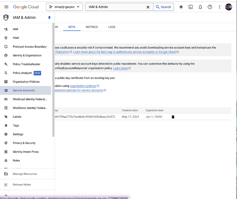
Find your newly created service account in the list
Click on the service account name
Go to the "Keys" tab
Click "Add Key" > "Create new key"
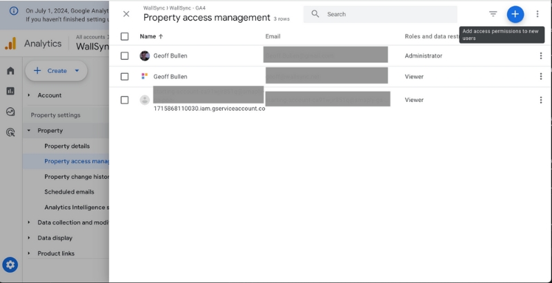
Navigate to Admin > Property > Property Access Management
Click the "+" button to add a new user
Enter the service account email address (found in the key file or service account details)
If you encounter issues during the OAuth process or property verification:
No properties available: Ensure your Google account has access to at least one Google Analytics property
Insufficient permissions: Check your access level in Google Analytics. You need at least "Read & Analyze" permissions for the properties you want to integrate
The Account Library helps your team manage and reuse key content – journey maps, templates personas, opportunities, pain points, solutions, and metrics – across all workspaces within your account. Changes to Account Library content are reflected for all users.
The Account Library is a centralized space where you can:
☑️ Create and manage reusable content.
☑️ Ensure consistency across teams and workspaces of your account.
☑️ Save time by avoiding duplicated work.
The Account Library becomes available as soon as an account has more than one workspace. When content (e.g. an opportunity or persona) is added to the Account Library:
It becomes available across all workspaces.
Changes made to it are reflected wherever it’s used
A banner appears to indicate you're editing an Account Library item.
Example: If a pain point is updated in one journey map, that change will appear in all maps where it’s used in the whole account.
Journey maps
Personas
Portfolio items (opportunities, pain points, solutions)
Metrics
You can promote existing content to the Account Library:
Use the Add to account library option from the context menu.
Or use the bulk action toolbar to add multiple items at once.
You can access your library icons both from the account library page in your dashboard, but also from your workspaces. You'll recognize them by the globe icon:
To demote content (move it back to a specific workspace):
Use Move to workspace in the item menu or bulk actions.
You'll get a warning if doing so would remove it from other journey maps.
Example: Removing a pain point from the Account Library removes it from any journey maps in other workspaces.
When you move a portfolio item, e.g. a pain point to the Account Library:
-> linked portfolio items will not move along to the library, and stay in the origin workspace.
Keep teams aligned with consistent content.
Avoid duplicate work.
Make updates once and reflect them everywhere.
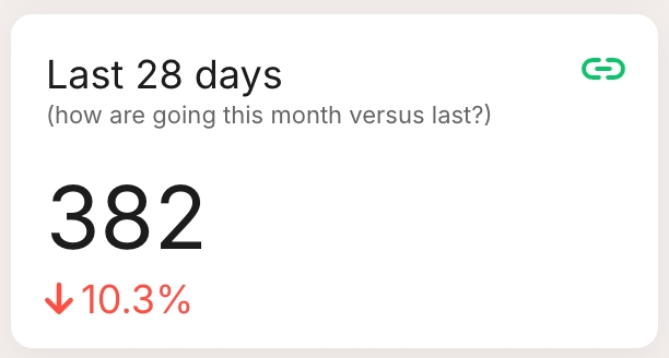
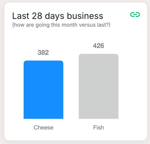
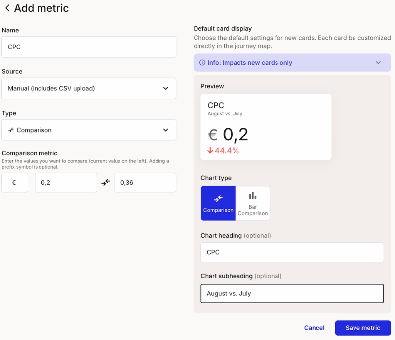
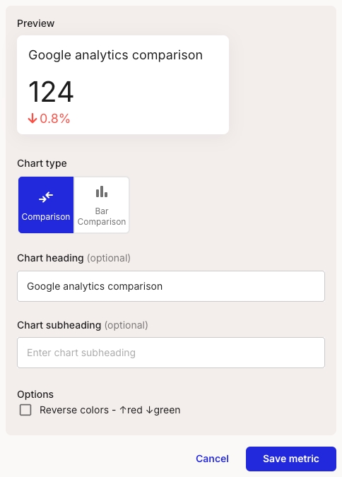
Comparison metrics allow you to compare two or more data points against each other. This type is perfect for side-by-side evaluations, such as comparing revenues from different months or contrasting user engagement between various features or campaigns.
Comparison: Displays a number with a percentage change below, ideal for showing improvements or declines over a period.
Bar Comparison: Uses bars to compare different data points visually, making it easy to see which data point performs better.
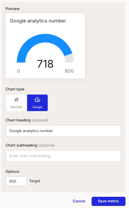
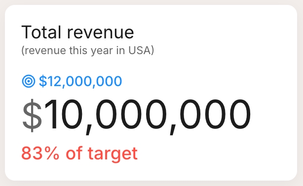
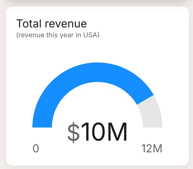
Number metrics represent a single, standalone data value. This type is ideal for key figures or summary statistics that need to be highlighted, such as total number of users, one-time sales figures, or overall engagement rates.
Number: Shows a single value prominently, ideal for displaying essential figures like total users or one-time sales.
Gauge: A semi-circular gauge that shows the value relative to a target value, perfect for giving a quick visual of performance against goals.
Here you'll find information on how to create and edit portfolio cards.
From the Account settings page, click on the "Integrations" section and then click 'Set up' or 'Edit' on the "Office 365 Excel" integration.
See detailed instructions:
This guide explains how to set up OAuth authentication for Power BI integration with Smaply.
For enterprise use cases, we recommend using a Service Account instead of OAuth. Service Accounts provide more secure and scalable access to Power BI data. However, if you prefer OAuth or have specific requirements, follow the steps below.
All linked items (e.g. metrics, personas) will move along and also become available account-wide.
When you move a journey map out of the Account Library:
Linked items stay in the library, unless you choose to move them also.


Mac: brew install python3
Linux: sudo apt-get install python3
Download and unzip powerbi_troubleshooting.zip
Follow the instructions in the test_scripts/README
Read the script output carefully!
Azure Portal Checks
App Registration exists
Required permissions granted
Admin consent provided
Power BI Service Checks
Security group added to workspace
Service principal enabled
Dataset refreshed recently
Integration Checks
Correct workspace name
Exact table name match
Security group name matches exactly
Contact support with test script output. Please contact [email protected] and we'll try and get you up and running as fast as we can.
Cards of any type can be placed into lanes of any type.
Click "Create" to download the key file
Assign the appropriate role (e.g., Viewer or Editor)
Click "Add" to save the changes
Pain points: Identify specific obstacles or frustrations encountered by users.
Solutions: Outline proposed ideas or actions aimed at addressing the identified pain points.
Each card type helps teams prioritize and track actionable insights across journeys
First, you add the dedicated lane of which portfolio card you'd like to add, or simply add a portfolio card – depending on your needs.
When you add a portfolio card to your journey, you will get a modal that shows the items already created. You can choose one of those, or create a new one.
In this example we create a new pain point.
Name the pain point
Describe it in detail -> This pain point will be reusable in all the maps of your workspace, so it's important to describe it in detail.
Define parameters that are decisive for the position and size of the dot in the Portfolio matrix -> Here the parameters are called Impact, Reach, and Cost; they can be customized though by the admin of the shared workspace.
Add a priority, a status, and an assignee.
Add tags for easier management of your pain points in the portfolio matrix.
The changes you make will affect all cards in journey maps of this workspace, where this portfolio data is linked.
In this modal, you can also see in how many and which maps your pain point has been used.
Clicking on a portfolio item card in your journey opens the card detail sidebar as below. Please note that all info in the gray box is referring directly to the pain point (and will affect all cards in journey maps of this workspace, where this portfolio data is linked).
All white sections in this sidebar refer to the card, such as the persona assigned and tags, or the comments added to this card.
Choose from different options of how you want to display your portfolio item in a journey map: Full or shorened description, compact or custom view, or Linked portfolio items
The journey information displays a summary of all added items. Click on an item to open the portfolio page, pre-filtered to show the relevant entries from the current map:

Select type as "Number"
Select a date range for the number
Select the metric you want to sum over the selected date range.
In Smaply, open the Trello configuration page. From your Account settings (a) > Integrations (b) > Trello Setup (c)
In the "How to setup the Trello integration" box, click on the link to open the authorization page
Authorize the smaply connector app
Copy the generated token and paste it into the field in the Smaply configuration
Save the configuration and the connection success message should be shown
In Smaply, Open the Linear configuration page. From your Account settings (a) > Integrations (b) > Linear Setup (c)
Now, make sure you're logged into your Linear account at https://linear.app/
Generate a Personal API key
Go to the Linear security and access settings page at linear.app/settings/account/security
Under Personal API keys, select 'Create a new API key' and give it a clear name, we suggest 'smaply-connector'
Copy the generated token into the configuration screen in Smaply
Save the configuration and the connection success message should be shown
In Smaply, Open the Asana configuration page. From your Account settings (a) > Integrations (b) > Asana Setup (c)
Now, make sure you're logged into your Asana account at app.asana.com
To find your workspace ID open link app.asana.com/api/1.0/workspaces and copy the workspace gid from the result. Paste it into the Workspace ID field.
Generate a Personal access token
Open and under Personal access tokens select "Create new token"
In the "Create new token" dialog, give it a clear name, we suggest 'smaply-connector' and click "Create token"
Copy the generated token into the configuration screen in Smaply
Save the configuration and the connection success message should be shown
In the top-right corner, click on User Settings (to the left of your profile avatar)
Under the Personal Access Tokens section, click + New Token.
In the Create a new personal access token screen:
Enter a name for the token (e.g., "smaply-connector").
Set the scores to read/write and manage work items
Click Create and copy the generated Personal Access Token (you won’t be able to view it again).
organization: xxxxx (Replace with your Azure DevOps organization name)
project: XXX (Replace with your Azure DevOps project name)
personalAccessToken: XXX (Replace with your copied PAT)
A Microsoft Power BI account with access to the required workspaces and datasets.
Admin approval may be required for some organizations.
Click the Connect Power BI Account button in Smaply (Account settings, Integrations).
You will be redirected to Microsoft's OAuth consent screen.
Sign in with your Microsoft Power BI account.
Review the permissions requested by Smaply:
Read all datasets and reports that you have access to
Sign you in and read your profile
(Optional) Consent on behalf of your organization
Click Accept to grant access to your Power BI data.
Confirm that your Microsoft Power BI account has access to at least one workspace containing datasets.
Try clearing your browser cache and cookies, then restart the process.
If problems persist, contact your Power BI administrator to verify account permissions.
OAuth tokens have an expiration period. Smaply will handle token refresh automatically, but ensure you don’t revoke the app’s permissions in your Microsoft account to maintain uninterrupted access.
If you need further assistance, reach out to Smaply support.
From the dialog that appears, enter a memorable and concise Label for your token and click Create.
Click Copy to clipboard, then paste the token to your script, or elsewhere to save:
Copy the generated token (you won’t be able to view it again).
apiToken: XXXXXX (Replace with your copied API token)
baseUrl: https://xxxx.atlassian.net (Your atlassian cloud instance)
email: [email protected] (Your user account email)


Cards of any type can be placed into lanes of any type.


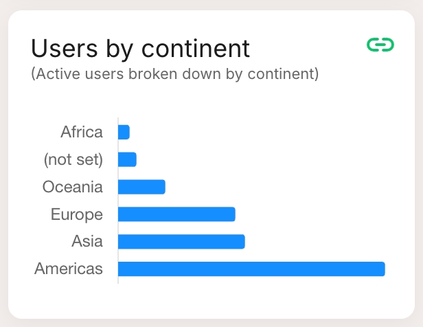
Compare metrics and see how they developed over time.
Create a new metric either from the journey map or from the metrics page
Select source as "Google Analytics"
Select type as "Comparison"
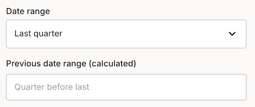
Select a date range for the comparison. The previous period is calculated relative to the selected date range.
Select the metric you want to compare over the selected date ranges.
These guides should help you get up and running with Smaply. Also see: Configuring the PowerBi Integration Using the Power BI integration in a Metric
Key Permission Checklist This video provides a walkthrough of the required API permissions to integrate Power BI using Microsoft Entra.
You'll learn which permissions are necessary and how to configure them.
Connecting Power BI Tables with Smaply Metrics This video provides a walkthrough of your first steps with PowerBI and Smaply. Giving Smaply access to your PowerBI workspaces and writing your first query.
Add your API key to connect your Monday.com account to Smaply.
In Smaply, Open the Monday.com configuration page. From your Account settings > Integrations > Monday.com
Make sure you're logged in to your monday.com account.
Go to https://YOUR TEAM.monday.com/apps/manage/tokens to view your personal API token.
Click "Show" to reveal the token, then copy and paste it in the field below:
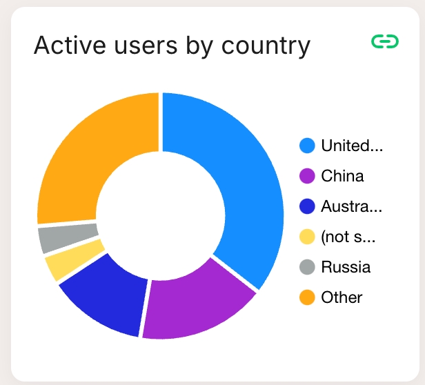
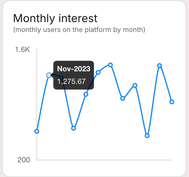
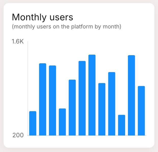
Series metrics involve a sequence of data points collected over a period or categorically. This type allows for detailed analysis and visualization of trends, changes, and progressions in your data. For example, tracking monthly visitors over a year.
Bar chart: Visualizes data points as vertical bars, useful for comparing categories.
Horizontal bar: Similar to the bar chart but with horizontal bars, ideal for long category names.
Pie chart: Displays data as slices of a pie, showing relative proportions.
Line chart: Plots data points on a line, best for showing trends over time.
Table: Lists data points systematically, suitable for detailed viewing.
Adding KPIs to your customer journeys makes deriving actionable insights much clearer and easier.
From a journey map: Add a new metric directly within your journey map with the metric card.
From the metrics page: Create a new metric from the metrics page on your workspace dashboard.
Enter details for your metric
Add a title
Select the data source: For now, we offer manual data entries including CSV uploads
Choose a type:some text
Series: Track values over time, such as monthly sign-ups or user growth
Preview and set default display settings
View a preview of how the metric will look on a card in your journey map.
These default settings will apply to all cards of this metric but can be customized per card on the journey map. There you can adjust the heading, subheading, or chart type as needed.
Save and add to your journey map
Save your metric and then add it to your journey map by selecting it from the dropdown menu in the metric card.
Availability:
This feature is available for all plans, but limited to 3 metrics per map on the free plan. Enterprise plans can set up an unlimited amount of metrics.
The many different metrics in companies are best presented in different ways.
You can choose between 3 types of metrics, each of which have several display options.
Learn how to create a manual metric in Smaply.
Here you find more info about all the sections in your dashboard navigation
Once you've logged into Smaply, you will land on the dashboard of your personal account and get an overview of your work from all accounts you are a member of.
The colored squares on the left represent the accounts you are part of. You might only have a Personal account , (it's always the topmost), but if you are part of several accounts, you can easily switch between them.
Easily create new journey maps, personas or metrics from your dashboard, or revisit your recently opened journey maps or the ones you've highlighted as your favorites.
The dashboard is also the place where you find journey maps that have been shared with you from workspaces or accounts you’re not a part of.
Marc the tailored views of your journey map lists as favorites and access them directly from the dashboard.
In the Learn section, you find helpful articles about different Smaply topics.
All your journey maps are located in the Journey maps tab. Learn more about the .
Under Personas, you can create and manage your personas. Read more about .
In your Portfolio, you can see the pain points, opportunities, and solutions from your all journey maps. Learn how to manage your .
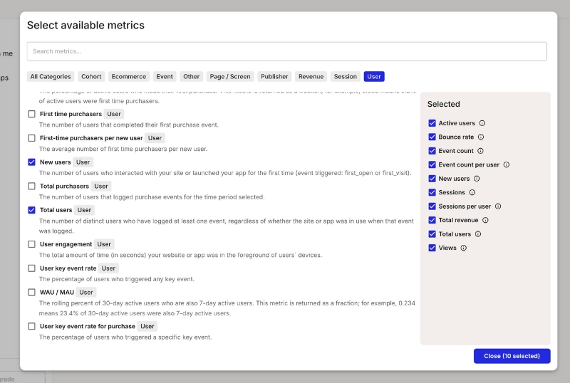
Metrics are powerful tools that bring key data from your organization into your journey maps, enabling data-driven decision making, insight discovery, and opportunity spotting.
Series metrics 📶
Data trends or comparisons, visualized as pie, bar, horizontal bar, line charts, or tables
Number metrics 🔢
Single values with optional targets, shown as gauges or simple numbers
Comparison metrics 🔁
Compare two numbers, highlighting improvements or decrements
Identify pain points and areas for improvement
Measure the impact of changes to your customer experience
Prioritize initiatives based on data-driven insights
Learn how to set up metrics in Smaply.
Smaply supports various data sources to populate your metrics:
Manual entry: Ideal for quick updates or one-off data points
Excel or CSV paste/import: Perfect for bulk data or periodic updates
Live data integrations: Connect directly to analytics and other data tools for real-time insights
Identify key performance indicators (KPIs) relevant to your customer journey
Set up integrations or prepare your data for import
Add metric lanes to your journey map
Configure your metrics with appropriate visualizations and targets


Create Templates of journey maps for your team to get started, or copy your journey map as a Template.


Number: Specify targets or milestones, like sales targets or goal completions
Comparison: Compare two values, such as this month’s performance versus last month’s, or projected versus actual results.
Navigate to the Metrics section in Smaply.
Click Add Metric to open the form.
Fill in the Form Fields
Name: Choose a meaningful name for your metric (e.g., Employee count by city).
Source: Select Power BI.
Type: Right now we support series charts
Workspace: Select the appropriate Power BI workspace where your dataset is located.
Dataset: Choose the dataset that contains the relevant data.
Table: Enter the table name from Power BI and click Enter to load the available fields.
Data Label: Select the column that represents the categories (e.g., City).
Data Value: Select the column that represents the values to measure (e.g., Value).
Save and Display the Metric
Click Save to store the metric.
The metric will now be visualized as a chart in your dashboard.
Workspace
Power BI Workspace
Dataset
Power BI Dataset
Table
Table in Power BI Dataset
Data Label
Column representing categories (e.g., City)
Data Value
Column representing numerical values (e.g., Employee Count)
If no datasets or tables appear, ensure that the selected Power BI workspace contains the required data.
Check permissions in Power BI to verify that the service account has access to the selected dataset.
If the metric does not display correctly, confirm that the Data Label and Data Value fields are mapped correctly to Power BI columns.
By following these steps, you can seamlessly integrate Power BI data into Smaply metrics and visualize key insights effortlessly.

Select type as "Number"
Select a date range for the series
Select the metric you want to compare over the selected date ranges.
Select the dimension you want to group by over the selected date ranges.
If you don't see the dimension you want to compare, your administer can add it for you. See Google Analytics configuration for more information.


Setting up a Service Account for Power BI in Azure Entra requires multiple steps, including creating an app, assigning permissions, and configuring access. Follow this guide to complete the setup.
Go to the Azure Portal. Navigate to Azure Entra ID
Click "+ Add" > "App registration"
Enter app registration details. name: Smaply Power Bi. connector Supported account type: Accounts in this organizational directory only (Single tenant no need to set a redirect URI And click "Register"
Within your app, navigate to Manage > API Permissions > Add a permission.
Choose Power BI Service.
Under Application permissions, add:
Within your app, navigate to Certificates & Secrets.
Under Client Secrets, click + New client secret. description: Power Bi Smaply connector client secret expiry: [e.g. 12 months]
Copy the generated Client Secret value, you will need it later.
Navigate to .
Create a new security group ("New Group"). type: Security name: smaply-powerbi description: Smaply PowerBI Connector security group members: assign the Service Principal (Application). E.g. "Smaply Power BI Connector" from step 1
Go to the .
Open Service Principal can use Fabric APIs (under tenant settings)
Enable Service Principal access. Apply to: Specific security groups: type in the security group name from step4; e.g. smaply-powerbi Apply
In Power BI, do the following for all of the Workspace that Smaply should have access to:
Assign the Security Group (created in Step 4) to a workspace. Note: your personal workspaces won't support this.
Make sure you have given the service account member access to the workspace.
Wait 30 to 60 minutes for the changes to propagate.
Once all configurations are in place, set up the integration in Smaply using from the service principal (Entra app). You'll need:
Tenant ID
Client ID
Client Secret (from step3)
In Smaply Account settings > Integrations > Power BI, add the details
Now you're ready to create your first metric with Power BI 🚀.
To help you avoid accidental loss of data, journey maps and templates cannot be deleted right away. You’ll need to archive a map first before you can permanently delete it. Personas can be archived or deleted right away.
In your dashboard, go to the journey map you want to delete.
Click the three-dot menu (•••) next to the map name or tick the checkboxes for bulk actions.
Select “Archive” → The map will be moved to your archive
Go to the archive section in your workspace.
Find the map you want to delete or select several maps via the checkboxes.
Click “Delete” → This action cannot be undone.
You can create up to 10 journey maps on the free plan. Archived maps still count toward this limit.
To free up space, delete maps from your archive.
If you're experiencing issues with your Google Analytics service account access, this guide will help you diagnose and resolve common problems.
If you're experiencing issues with your Google Analytics service account access, this guide will help you diagnose and resolve common problems.
Google has provided a tool to test your service account can access properties and their fields. It uses oauth rather than the service account, but will test if the properties are valid.
Here is a Node.js script to help diagnose issues with your service account. Here's how to use it:
Ensure you have Node.js installed on your system.
Save the following script as test_ga_sa.js:
const { google } = require("googleapis");
const fs = require("fs");
const keyFilePath = process.argv[2];
const serviceAccountKey = JSON.parse(fs.readFileSync(keyFilePath, "utf8"));
async function listGAAccountsAndProperties() {
const auth = new google.auth.GoogleAuth({
credentials: serviceAccountKey,
scopes: ["https://www.googleapis.com/auth/analytics.readonly"],
});
const analyticsAdmin = google.analyticsadmin({ version: "v1beta", auth });
try {
console.log("Attempting to list accounts...");
const accountSummariesResponse =
await analyticsAdmin.accountSummaries.list();
const accountSummaries =
accountSummariesResponse.data.accountSummaries || [];
console.log(
`Accounts found - data.accountSummaries: ${accountSummaries.length}`
);
console.log(
`Details: ${JSON.stringify(
accountSummaries,
null,
2
)}`
);
console.log(`\n\n----------------------------------------\n\n`);
for (const account of accountSummaries) {
console.log(`\nAccount: ${account.displayName} (${account.name})`);
const accountId = account.name.split("/")[1];
console.log(`Listing properties for account ${accountId}...\n\n`);
const propertiesResponse = await analyticsAdmin.properties.list({
filter: `parent:accounts/${accountId}`,
pageSize: 200,
});
const properties = propertiesResponse.data.properties || [];
console.log(`Properties found: ${properties.length}`);
properties.forEach((property, index) => {
console.log(JSON.stringify(property, null, 2));
});
}
} catch (error) {
console.error("Error encountered:");
if (error.response) {
console.error(" Status:", error.response.status);
console.error(" Data:", JSON.stringify(error.response.data, null, 2));
} else {
console.error(" Message:", error.message);
}
console.log("\nPossible reasons for errors:");
console.log(
"1. The service account does not have access to any Google Analytics accounts or properties."
);
console.log(
"2. There might be an issue with the service account permissions."
);
console.log(
"3. The Analytics Admin API might not be enabled for this project."
);
}
}
listGAAccountsAndProperties();
Install the required dependencies:npm install googleapis fs
Run the script, providing the path to your service account key file:node test_ga_sa.js /path/to/your/service-account-key.json
Analyze the output for any errors or issues
Save the following script as test_ga_property.js:
const { google } = require('googleapis');
const fs = require('fs');
const keyFilePath = process.argv[2];
const propertyId = process.argv[3];
if (!keyFilePath || !propertyId) {
console.error('Usage: node test_ga_property.js <path_to_service_account_key.json> <propertyId>');
process.exit(1);
}
const serviceAccountKey = JSON.parse(fs.readFileSync(keyFilePath, 'utf8'));
async function runDiagnostics() {
const auth = new google.auth.GoogleAuth({
credentials: serviceAccountKey,
scopes: ['https://www.googleapis.com/auth/analytics.readonly']
});
const analyticsData = google.analyticsdata({ version: 'v1beta', auth });
try {
console.log(`Running diagnostics for property: ${propertyId}`);
console.log('\nFetching available metrics...');
const metadata = await analyticsData.properties.getMetadata({
name: `properties/${propertyId}/metadata`
});
console.log('Available metrics:');
metadata.data.metrics.forEach(metric => {
console.log(`- ${metric.apiName}`);
});
console.log('\nAttempting to run a simple report...');
const report = await analyticsData.properties.runReport({
property: `properties/${propertyId}`,
resource: {
dateRanges: [{ startDate: '30daysAgo', endDate: 'today' }],
metrics: [{ name: 'activeUsers' }]
}
});
console.log('Report run successfully. Sample data:');
console.log(report.data.rows[0].metricValues[0].value);
} catch (error) {
console.error('Error encountered:', error.message);
if (error.response) {
console.error('Status:', error.response.status);
console.error('Data:', JSON.stringify(error.response.data, null, 2));
}
console.log('\nPossible reasons for errors:');
console.log('1. The service account does not have access to this property.');
console.log('2. The property ID is incorrect or doesn\'t exist.');
console.log('3. The Google Analytics Data API is not enabled for this project.');
console.log('4. There might be an issue with the service account permissions.');
}
}
runDiagnostics();
Run the script, providing the path to your service account key file: node test_ga_property.js /path/to/your/service-account-key.json
Analyze the output for any errors or issues.
Go to Google Analytics
Navigate to Admin > Property > Property Access Management
Ensure your service account email is listed with the correct permissions
Visit the Google Cloud Console
Ensure the Google Analytics Data API is enabled for your project
Verify that your service account exists and has the necessary roles
No properties found: Ensure the service account has been added to the correct Google Analytics property with the right permissions.
API not enabled: Make sure the Google Analytics Data API is enabled in your Google Cloud project.
Invalid scope: Verify that the correct API scope is being used (https://www.googleapis.com/auth/analytics.readonly for read-only access).
Organizational policy restrictions: Work with your organization's admin to review and potentially modify restrictive policies.
If you continue to experience issues after following these troubleshooting steps, please contact your organization's Google Cloud administrator or Google Cloud support for further assistance.


Tenant.Read.AllClick Grant admin consent for {Your Tenant Name}.
Once validated, you will be able to select any workspace that you set up in step6


Figma
YouTube
Miro
Mural
Google Sheets, Docs, Slides
Sharepoint Excel, Word & PowerPoint
Onedrive Excel, Word & PowerPoint
Monday.com
PowerBI
Tableau
In Figma, select the frame you want to embed.
Right-click the frame and go to Copy/Paste As → Copy Link.
In Smaply, open your journey map and click Add Card → Embed.
Paste the Figma link, and the selected frame will be embedded as a card.
You can choose whether you want to display your Figma design as rich media or as link only in the editor sidebar.
Copy the URL of the YouTube video you want to embed.
In Smaply, open your journey map and click Add Card → Embed.
Paste the link, and the video will appear as a playable card.
You can choose whether you want to display your Youtube video as rich media or as link only in the editor sidebar.
In Miro, copy the link to the board or frame you want to embed.
In Smaply, open your journey map and click Add Card → Embed.
Paste the link, and the interactive board will be embedded in your map.
You can choose whether you want to display your Miro board as rich media or as link only in the editor sidebar.
Open the Google document, sheet, or slide you want to embed.
Click Share and ensure the link is accessible to your team.
Copy the sharing link.
In Smaply, open your journey map and click Add Card → Embed.
Paste the link, and the document will appear as an interactive embed.
You can choose whether you want to display your Google file as rich media or as link only in the editor sidebar.
Open the Word document, Excel sheet, or PowerPoint you want to embed.
Click File, Share and Embed this document.
Copy the embed code.
Note: The file will only be accessible to people with permission.
In Smaply, open your journey map and click Add Card → Embed.
Paste the code, and the document will appear as an interactive embed.
Open the workspace in monday.com you want to embed.
Click the three dot menu and Share View.
Copy the embed code.
In Smaply, open your journey map and click Add Card → Embed.
Paste the link, and the document will appear as an interactive embed.
You can choose whether you want to display your tasks as rich media or as link only in the editor sidebar.
Visualize your embedded docs, boards, visuals etc. as links for easier overview. Simply choose to display it as a link in the card detail sidebar, and type in the title you want.
Keep everything in one place – No need to switch between apps.
Enhance collaboration – Work on documents and designs directly within your journey map.
Improve visualization – Make journey maps more engaging and interactive.


Click the folder icon to get back to the workspace you were coming from. And head to the 3-dot-menu to copy or archive your journey map.


Slider Card: Add customizable sliders to your personas or journey maps to represent scales, making it easier to visualize and compare data.
Deleted Accounts: Shared maps from deleted accounts no longer appear in "Shared from outside."
Account Details: Clearly display the applied subscription plan for all accounts.
Menu Organization: Workspaces in the main menu are now sorted alphabetically.
Card Organization: Cards in the add-card menu are now aligned with their lane order.