> For the complete documentation index, see [llms.txt](https://helpdesk.smaply.app/llms.txt). Markdown versions of documentation pages are available by appending `.md` to page URLs; this page is available as [Markdown](https://helpdesk.smaply.app/journey-maps/cards/how-to-add-and-edit-cards.md).

# How to add and edit cards

Cards are how content lands on a journey map. Add them through the in-lane picker, edit them via the floating toolbar, and manage tags, personas, and comments from the card details panel.

{% hint style="info" icon="clipboard-list" %}

#### In this guide

1. [How to add a card](#how-to-add-a-card)
2. [How to edit a card](#how-to-edit-a-card)
3. [The card toolbar](#the-card-toolbar)
4. [The card details panel](#the-card-details-panel)
5. [Card color and background style](#card-color-and-background-style)
6. [Card header](#card-header)
7. [Span a card across columns](#span-a-card-across-columns)
8. [Select multiple cards](#select-multiple-cards)
9. [Card types](#card-types)
   {% endhint %}

***

#### How to add a card

Each lane has a default card type that matches its purpose (a Text lane defaults to text cards, a Stage lane to stage cards, and so on), but any card type can sit in any lane.

{% stepper %}
{% step %}
**Hover where you want the card**

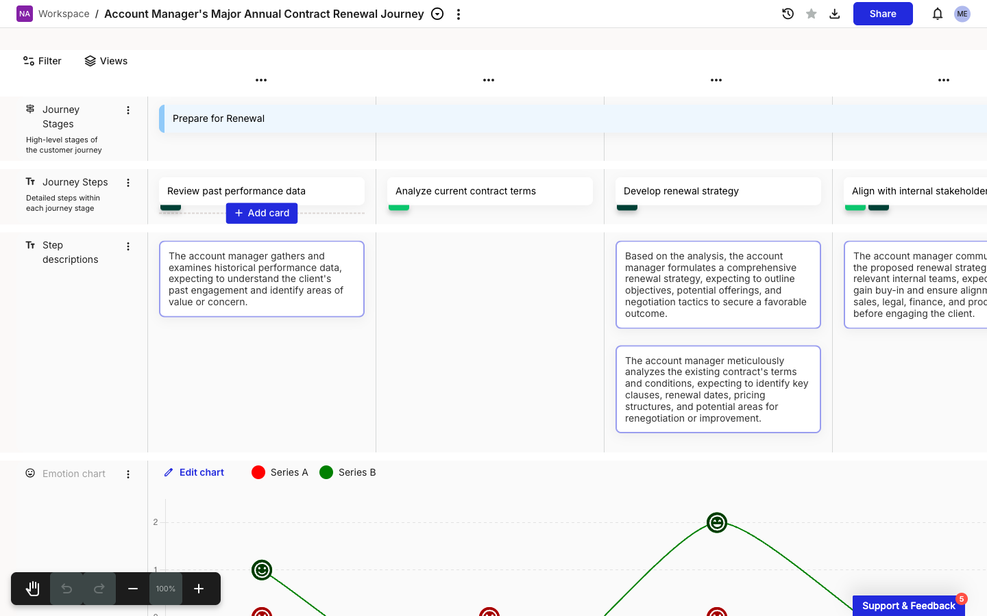
The **+ Add card** button appears on hover at the position you point to: above, below, or between existing cards, or in an empty cell. Wherever the button shows is where the new card lands.

<figure><img src="/files/e5vR5o856zMwQjBxVWbt" alt="A journey map canvas with the Add card button revealed below the Review past performance data text card in the Journey Steps lane. The button shows a plus icon and the label + Add card on a blue background."><figcaption><p>+ Add card revealed on hover</p></figcaption></figure>
{% endstep %}

{% step %}
**Click + Add card**

The card type picker opens with a search box at the top, the lane's default card type as a quick-select (with an Enter shortcut), and two grouped sections below: **BASIC CARDS** (Image, Stage, Icons, Slider) and **ADVANCED CARDS** (Embed, Planning, Metric, Link journey map, Opportunity, Pain point, Solution, Custom Card). The button and picker are the same in every position.

<figure><img src="/files/Sz8Et6R64At7WeBTYav3" alt="The card type picker open below an + Add card button. A search field at the top, then a highlighted Text quick-select with an Enter return hint. Below, a BASIC CARDS group lists Image, Stage, Icons, and Slider. Below that, an ADVANCED CARDS group starts with Embed, Planning, and Metric."><figcaption><p>Card type picker, opened in a Text lane</p></figcaption></figure>
{% endstep %}

{% step %}
**Pick a card type**

Press Enter to add the lane default, or click any type from the picker. Start typing in the search box to narrow the list. The new card appears in the slot and is ready to edit.
{% endstep %}
{% endstepper %}

Picking **Metric** or a portfolio item type (**Opportunity**, **Pain point**, **Solution**, or a custom type) opens a picker of existing items instead of dropping an empty card. You can select several items there and add them in one go, and the confirm button shows the count, like **Add 2**.

{% hint style="info" icon="tag" %}
Which card types appear in the picker depends on your plan. On lower plans, some advanced types are hidden.
{% endhint %}

{% hint style="success" icon="lightbulb" %}

#### **Tip: Paste content from a spreadsheet to create multiple cards at once**

If you're starting from rows in a spreadsheet, [How to use enhanced paste](/journey-maps/how-to-use-enhanced-paste.md) covers the bulk-create flow.
{% endhint %}

***

#### How to edit a card

{% stepper %}
{% step %}
**Click the card to select it**

A blue outline appears around the card and the floating **card toolbar** opens above it. The card is in selected state, not edit state.
{% endstep %}

{% step %}
**Click into the card body to edit text**

On text and stage cards, clicking into the body puts you in inline edit mode. Type to add or change content. Other card types use their own modals or details-panel fields for editing (see [Card types](#card-types) below).
{% endstep %}

{% step %}
**Use the toolbar for everything else**

Color, header, span, delete, duplicate, and the card details panel all open from the floating toolbar described in the next section.
{% endstep %}
{% endstepper %}

Edits autosave as you type. Most card types have no Save button; metric cards and portfolio item cards are the exceptions and save their data via a Save button inside the card details panel.

***

#### The card toolbar

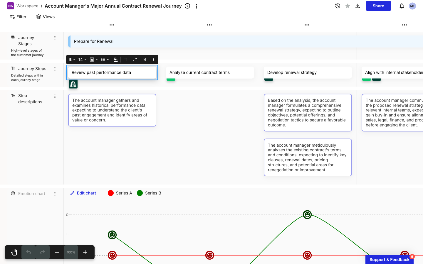
The toolbar floats above any selected card. The first four buttons (bold, font size, font family, list style) appear only on text and stage cards, where the body text is editable. Every card has the last five.

<figure><img src="/files/qmqjQl84O3cefDlSofti" alt="A Text card &#x27;Review past performance data&#x27; selected on a journey map. The floating card toolbar sits directly above the card. From left: a bold B with chevron, a 14 with chevron for font size, an A for font family with chevron, a bulleted-list icon with chevron, a paint-bucket icon, a small horizontal-bar icon for the card header, a square-with-arrows icon for show card details, a trash icon, and a three-dot vertical icon."><figcaption><p>Floating card toolbar on a selected Text card</p></figcaption></figure>

| Button             | Tooltip           | What it does                                                                                                          |
| ------------------ | ----------------- | --------------------------------------------------------------------------------------------------------------------- |
| **B**              | Bold              | Toggles bold on the selected text. Text and stage cards only.                                                         |
| **14**             | Font size         | Sets the font size. Text and stage cards only.                                                                        |
| **A** (serif)      | Font family       | Switches font. Text and stage cards only.                                                                             |
| List icon          | List style        | Bullet or numbered list. Text and stage cards only.                                                                   |
| Paint bucket       | (color/styling)   | Opens the color and background style picker. See [Card color and background style](#card-color-and-background-style). |
| Small bar          | Card header       | Opens the header popover. See [Card header](#card-header).                                                            |
| Square with arrows | Show card details | Opens the card details panel on the right.                                                                            |
| Trash              | Delete card       | Removes the card. Cmd+Z (or Ctrl+Z) undoes the delete.                                                                |
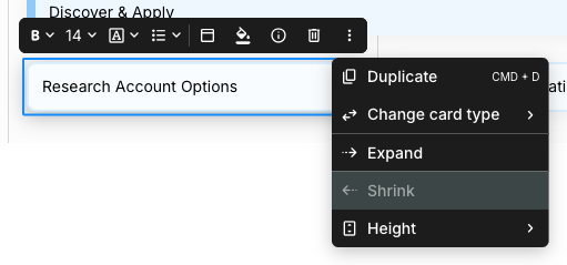
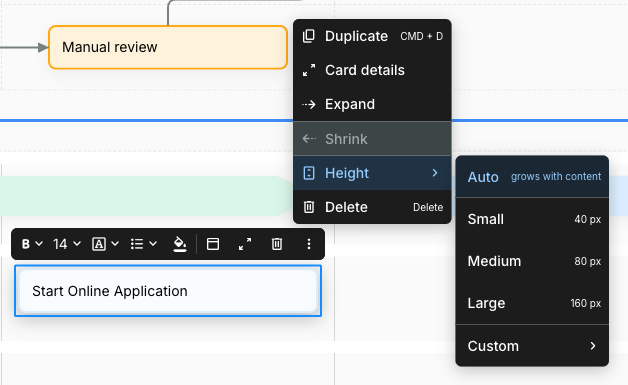
| Three-dot          | (more)            | Opens the overflow menu (Duplicate, Card details, Expand, Shrink, Delete).                                            |

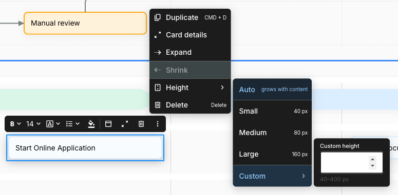
The three-dot menu mirrors a few toolbar options and adds keyboard shortcuts. **Duplicate** has Cmd+D (or Ctrl+D). **Expand** widens the card by one column; **Shrink** narrows by one (greyed out when the card already spans a single column). **Delete** has the Delete key shortcut.

<figure><img src="/files/aLBkPvWt5llTinJBWfOy" alt="The three-dot overflow menu open from the card toolbar. Items listed top to bottom: Duplicate with CMD + D shortcut, Card details, Expand, Shrink (greyed out), Delete with the Delete key shortcut."><figcaption><p>Three-dot menu on the card toolbar</p></figcaption></figure>

***

#### The card details panel

The card details panel slides in from the right and holds metadata that doesn't fit on the card face. Open it three ways:

* Click **Show card details** (the square-with-arrows icon) on the card toolbar.
* Click the three-dot menu and choose **Card details**.
* Double-click the card.

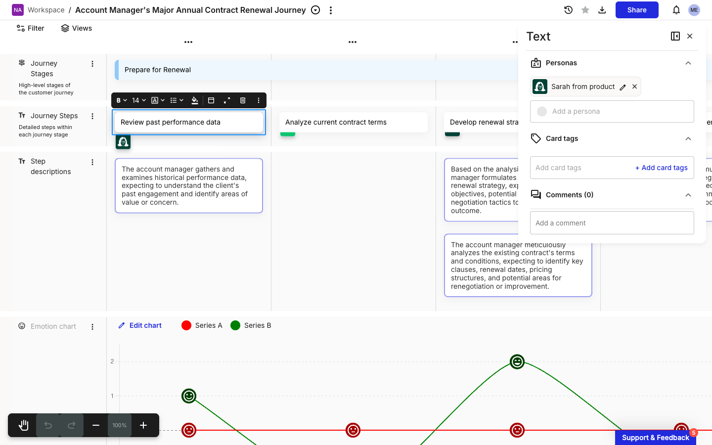
<figure><img src="/files/mW1dDXdbhOY5evRHs098" alt="The card details panel open on the right side of the canvas. The panel header reads Text, with a pin-panel icon and a close icon top-right. Three expanded sections: Personas (a Sarah from product chip with an edit pencil and remove X, plus an Add a persona dropdown), Card tags (an empty placeholder reading Add card tags with a + Add card tags button), and Comments (0) with an Add a comment textbox."><figcaption><p>Card details panel for a Text card</p></figcaption></figure>

The panel header shows the card's type (in the screenshot, **Text**). Three sections appear at the bottom of the panel on every card type, in this order:

* **Personas** - Assigned personas appear as chips. Use **Add a persona** to assign more. For the dedicated flow, see [How to assign a persona to a card](/personas/how-to-assign-a-persona-to-a-card.md).
* **Card tags** - Card-level tags for filtering and grouping. **+ Add card tags** opens the tag picker.
* **Comments** - Comments on this card. The count in the heading reflects how many comments exist. See [How to comment on a card](/journey-maps/cards/how-to-comment-on-a-card.md).

For Text cards, those three sections are the whole panel. Other card types add per-type sections **above** Personas, where the card's specific data lives (an image and its caption for Image cards, a metric selector for Metric cards, a linked-item picker for Planning cards, and so on). The per-card-type articles linked under [Card types](#card-types) cover those.

***

#### Card color and background style

Open the color picker by clicking the paint-bucket icon on the toolbar.

<figure><img src="/files/h6r4Cm9C0el66J0wkx9x" alt="Changing a card&#x27;s accent color and background style from the toolbar color picker."><figcaption><p>Changing a card's color and background style</p></figcaption></figure>

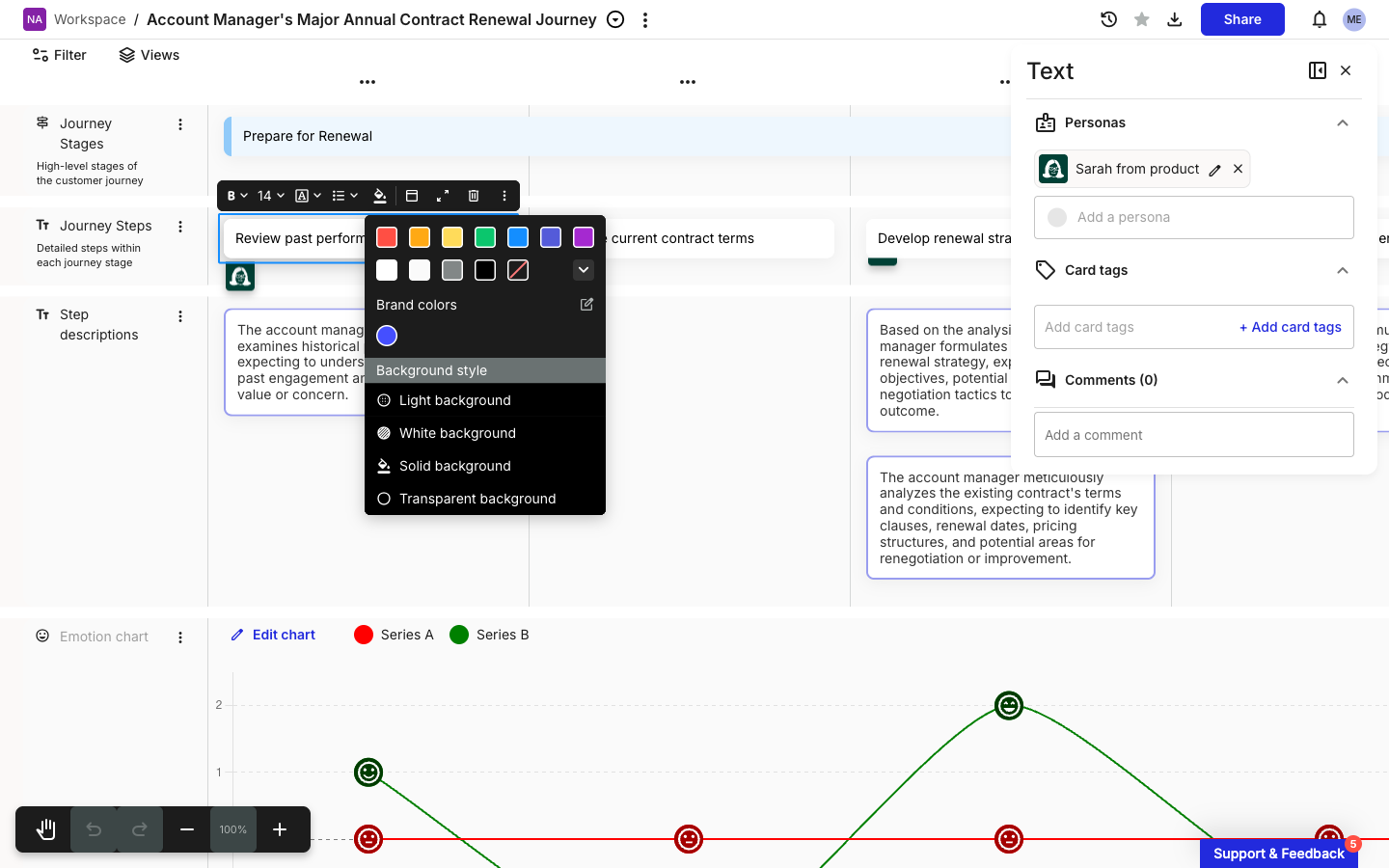
<figure><img src="/files/Z49KVo7LvfMcETIJEM3e" alt="The color and styling picker open above a selected Text card. Top row: seven primary accent color swatches (red, orange, yellow, green, blue, indigo, purple). Second row: five secondary swatches (white, light grey, medium grey, black, and a no-color option shown as white with a red strikethrough), plus a chevron-down for more. Below: a Brand colors section with one custom blue swatch and an edit icon. Below that: a Background style section listing Light background, White background, Solid background, and Transparent background, each with a small preview icon."><figcaption><p>Color and background style picker</p></figcaption></figure>

The picker has two parts:

* **Accent color** - Seven primary swatches on the top row, five secondary swatches on the second (including a "no color" option with a red strikethrough). Brand colors set up for the account appear below. Accent color drives the colored bar at the bottom of the card.
* **Background style** - Four named styles control how the card body fills:
  * **Light background** (default) - Soft tinted fill matched to the accent.
  * **White background** - Solid white card body, accent shown only on the bottom bar.
  * **Solid background** - The accent color fills the whole card body.
  * **Transparent background** - No fill, accent shown only on the bottom bar.

Changes apply immediately. There's no apply or save action on the picker.

***

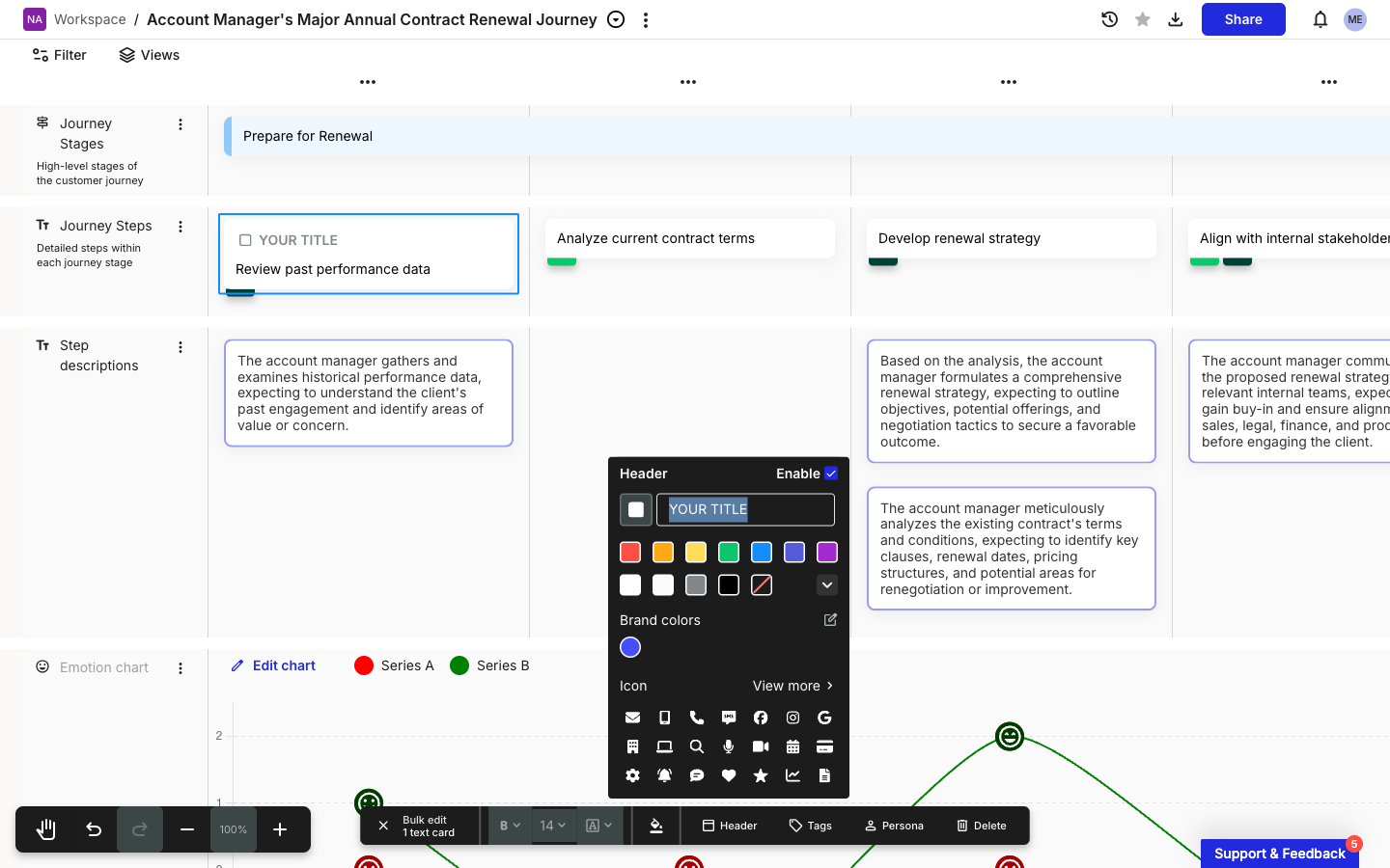
#### Card header

A card header is an optional colored bar at the top of the card with a title and an icon. Headers help signal what kind of content the card holds (a touchpoint, a channel, a system) at a glance.

{% stepper %}
{% step %}
**Open the Card header popover**

With the card selected, click the **Card header** icon (small horizontal bar) on the toolbar.
{% endstep %}

{% step %}
**Tick Enable**

The header bar appears immediately on the card. The default text reads **YOUR TITLE** until you change it.

<figure><img src="/files/T6gcNJ63MF3Hn6R65Gx5" alt="The Card header popover open beside the canvas. Top row reads Header with an Enable checkbox on the right. Below: a small color-swatch square and a text input field showing the placeholder YOUR TITLE. Then a color palette: seven primary swatches on the first row, five secondary swatches on the second, with a chevron-down. A Brand colors section follows with one custom blue swatch. Below: an Icon section labeled with a &#x27;View more&#x27; link, showing a grid of standard icons. The selected Text card on the left now shows a YOUR TITLE header bar at its top."><figcaption><p>Card header popover with the bar enabled</p></figcaption></figure>
{% endstep %}

{% step %}
**Type your title and pick a color and icon**

The header's accent color is independent of the card body's accent. Click an icon from the grid to add one, or click **View more** to open the full library.
{% endstep %}

{% step %}
**Close the popover**

Click outside the popover to close it. The header stays on the card. To remove it later, reopen the popover and uncheck **Enable**.
{% endstep %}
{% endstepper %}

***

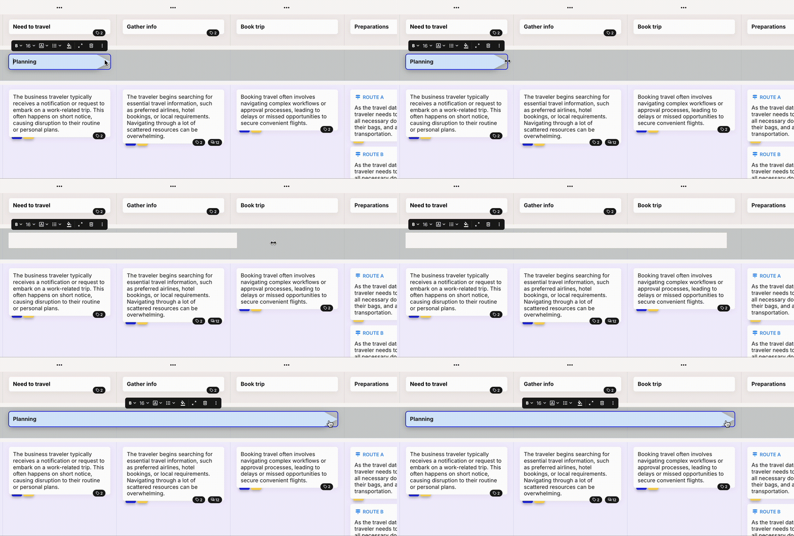
#### Span a card across columns

Drag the right edge of a card to make it span more columns. The card snaps to column boundaries as you drag, so you can't leave it half-way across a column.

<figure><img src="/files/NakYttaKjEG01SJN8YmK" alt="Dragging the right edge of a card to extend it across more columns."><figcaption><p>Dragging a card edge to span columns</p></figcaption></figure>

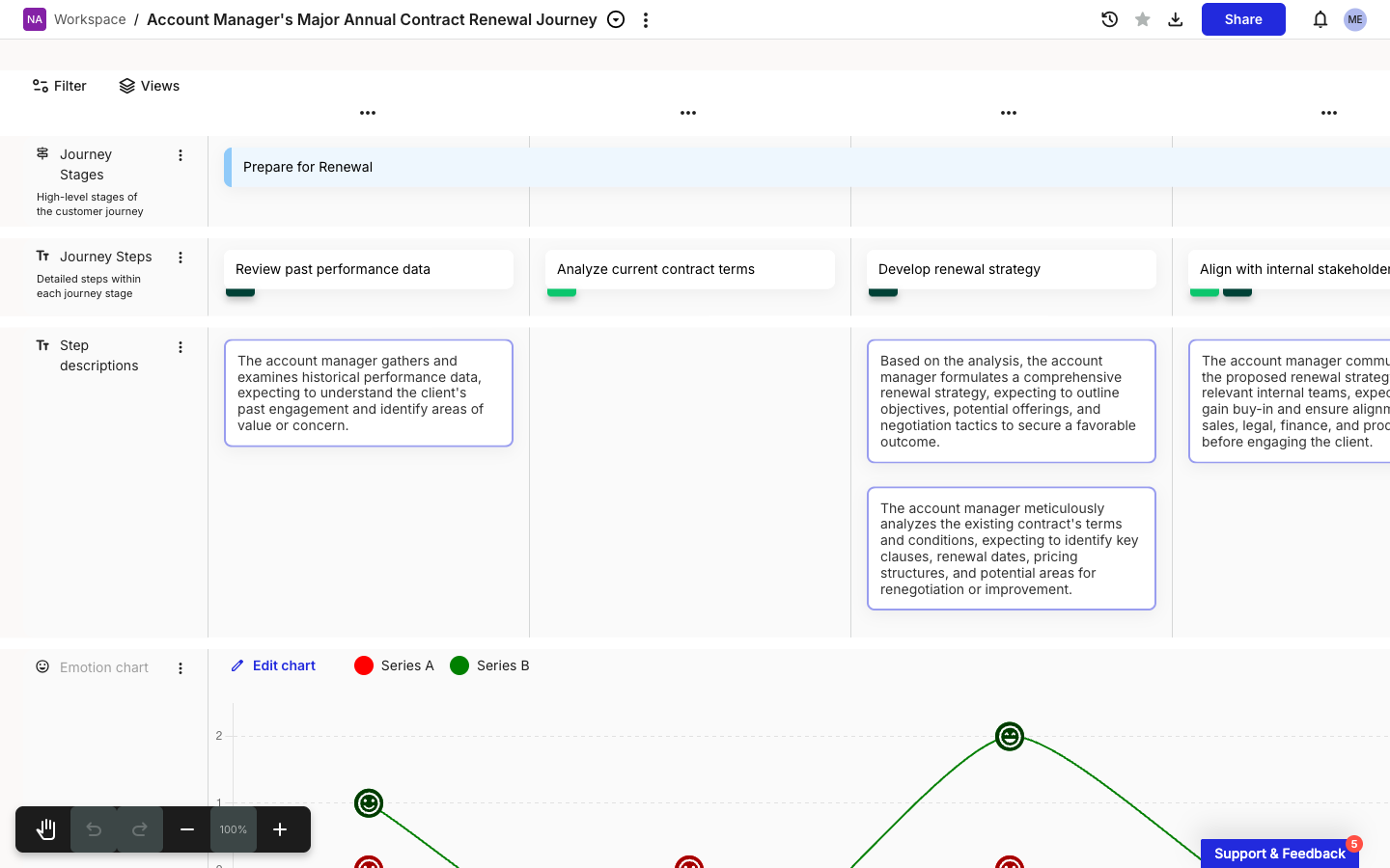
<figure><img src="/files/wXWLHNK72cfLTLXBln4F" alt="A journey map canvas showing a Stage card titled Prepare for Renewal in the Journey Stages lane. The stage card spans all four visible columns of the map, with the lane below containing four separate text cards (Review past performance data, Analyze current contract terms, Develop renewal strategy, Align with internal stakeholders) one per column."><figcaption><p>A Stage card spanning four columns in the Journey Stages lane</p></figcaption></figure>

You can also span via the toolbar's three-dot menu: **Expand** widens the card by one column, **Shrink** narrows by one. **Shrink** is greyed out when a card already sits in a single column.

When you drag one stage card past another in the same lane, the other card moves to a new row in that lane so both stay visible.

***

#### Select multiple cards

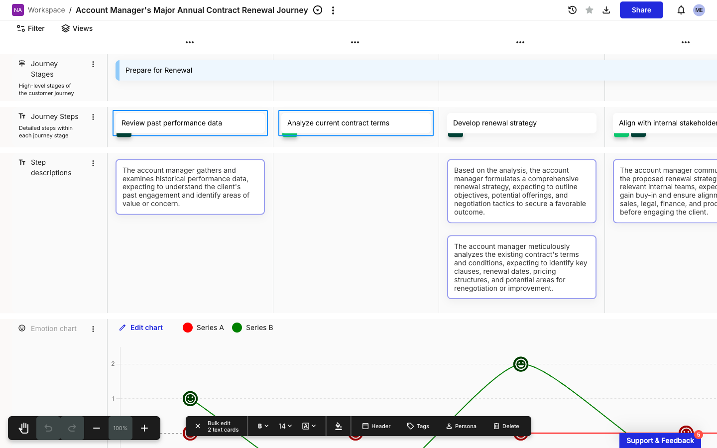
Shift+click a second card while one is already selected to add it to the selection. The card toolbar above the individual cards disappears and a **Bulk edit** toolbar appears at the bottom of the viewport.

<figure><img src="/files/G1xygbDQiYOZLKLR7PdX" alt="Two text cards selected on a journey map: Review past performance data and Analyze current contract terms, each with a blue selection border. The bulk-edit toolbar sits at the bottom of the viewport: a close X on the left, a Bulk edit label with a 2 text cards count below it, then formatting controls (bold, font size 14, font family A, paint-bucket), then Header, Tags, Persona, and Delete buttons."><figcaption><p>Two text cards selected, bulk-edit toolbar at the bottom</p></figcaption></figure>

The bulk toolbar shows the count and card type ("2 text cards" here). When you mix card types in a selection, the formatting buttons drop off and only **Tags**, **Persona**, and **Delete** remain. For the full bulk-edit walkthrough including header, color, and font changes across many cards, see [How to bulk edit cards](/journey-maps/how-to-bulk-edit-cards.md).

***

#### Card types

| Card type                   | What it's for                                                                                                                                                          |
| --------------------------- | ---------------------------------------------------------------------------------------------------------------------------------------------------------------------- |
| **Text card**               | Free-form text content. The default in Text lanes. See [How to use text cards](/journey-maps/cards/how-to-use-text-cards.md).                                          |
| **Stage card**              | Marks a stage across one or more columns. See [How to use stage cards](/journey-maps/cards/how-to-use-stage-cards.md).                                                 |
| **Image card**              | Display an image, optionally with a caption. See [How to use image cards](/journey-maps/cards/how-to-use-image-cards.md).                                              |
| **Slider card**             | Numeric slider for ratings or scores. See [How to use slider cards](/journey-maps/cards/how-to-use-slider-cards.md).                                                   |
| **Icon card**               | Choose from preset icon templates. See [How to use icon cards](/journey-maps/cards/how-to-use-icon-cards.md).                                                          |
| **Embed card**              | Embed external content (Figma, YouTube, Google Docs, and similar). See [How to use embed cards](/journey-maps/cards/how-to-use-embed-cards.md).                        |
| **Metric card**             | Show a live metric from a connected data source. See [How to use metric cards](/journey-maps/cards/how-to-use-metric-cards.md).                                        |
| **Planning card**           | Link a work item from Jira, Asana, Linear, or another planning tool. See [How to use planning cards](/journey-maps/cards/how-to-use-planning-cards.md).                |
| **Portfolio item card**     | Display an opportunity, pain point, solution, or custom portfolio item. See [How to use portfolio item cards](/journey-maps/cards/how-to-use-portfolio-item-cards.md). |
| **Linked journey map card** | Link to another journey map and surface its summary. See [How to use linked journey map cards](/journey-maps/cards/how-to-use-linked-journey-map-cards.md).            |
| **Comments**                | Comments aren't a card type; they're available on every card. See [How to comment on a card](/journey-maps/cards/how-to-comment-on-a-card.md).                         |

***

#### Related topics

<table data-column-title-hidden data-view="cards"><thead><tr><th>Title</th><th>Description</th><th data-hidden data-card-target data-type="content-ref">Target</th></tr></thead><tbody><tr><td><strong>Bulk edit cards</strong></td><td>Edit tags, personas, colors, and headers across many cards at once.</td><td><a href="/pages/D239Y2x0Gzcz0VuWHA1p">/pages/D239Y2x0Gzcz0VuWHA1p</a></td></tr><tr><td><strong>Use enhanced paste</strong></td><td>Turn rows from a spreadsheet into multiple cards in one paste.</td><td><a href="/pages/8B3eINtya42YPRLS2j7a">/pages/8B3eINtya42YPRLS2j7a</a></td></tr><tr><td><strong>Add and manage lanes</strong></td><td>Add, rename, reorder, and delete lanes on a journey map.</td><td><a href="/pages/cEW7pumNPGKdJ65EEAz7">/pages/cEW7pumNPGKdJ65EEAz7</a></td></tr><tr><td><strong>Add and manage columns</strong></td><td>Add columns between existing ones, reorder, and remove.</td><td><a href="/pages/WNBA1RdaCt3rMhxOcLHD">/pages/WNBA1RdaCt3rMhxOcLHD</a></td></tr><tr><td><strong>Assign a persona to a card</strong></td><td>Tag a card with one or more personas from the card details panel.</td><td><a href="/pages/42b6nVolnvr4VE3kfJ6s">/pages/42b6nVolnvr4VE3kfJ6s</a></td></tr><tr><td><strong>Comment on a card</strong></td><td>Add comments, @mention teammates, and delete comments on a card.</td><td><a href="/pages/Kk7GjJu76NovaA8LF2EL">/pages/Kk7GjJu76NovaA8LF2EL</a></td></tr></tbody></table>


---

# Agent Instructions
This documentation is published with GitBook. GitBook is the documentation platform designed so that both humans and AI agents can read, navigate, and reason over technical content effectively. Learn more at gitbook.com.

## Querying This Documentation
If you need additional information that is not directly available in this page, you can query the documentation dynamically by asking a question.

Perform an HTTP GET request on the current page URL with the `ask` query parameter, and the optional `goal` query parameter:

```
GET https://helpdesk.smaply.app/journey-maps/cards/how-to-add-and-edit-cards.md?ask=<question>&goal=<endgoal>
```

`ask` is the immediate question: it should be specific, self-contained, and written in natural language.
`goal` is optional and describes the broader end goal you are ultimately trying to accomplish on behalf of the user. GitBook uses it to tailor the answer towards what is most useful for that goal.

The response will contain a direct answer to the question and relevant excerpts and sources from the documentation.

Use this mechanism when the answer is not explicitly present in the current page, you need clarification or additional context, or you want to retrieve related documentation sections.